APP Portal — A simplified workflow for managing software and hardware requests.
The Problem
App Portal was a legacy application from Flexera that needed to be integrated into the new Flexera One platform. In order to achieve this the application needed to be redesigned to align with the core styles and UX patterns of Flexera One.
I was responsible for
- User research
- Prototyping
- Interaction design
- UI design
— Background —
App portal is a self service application system that enables users to request and install software without assistance, while maintaining governance and control of software approvals and licensing.
As the application was being rebuilt I saw this as an opportunity to enhance the user experience and efficiency of the existing application.
— My process —
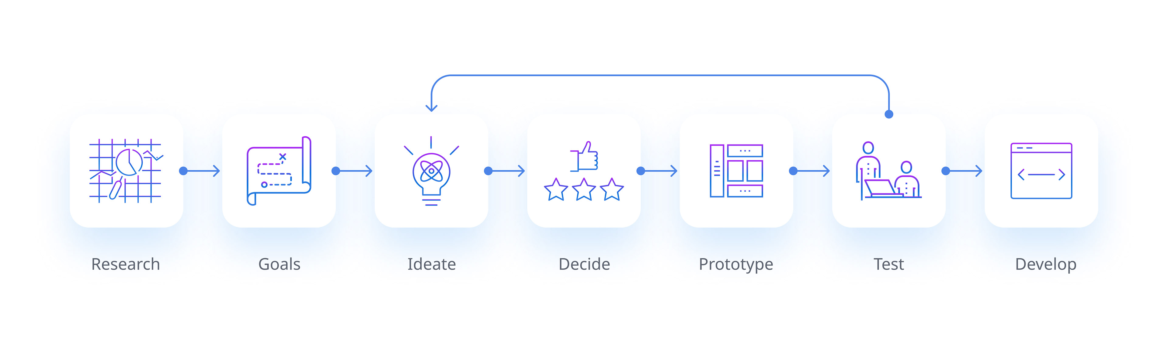
— Research —
I conducted a comprehensive analysis of the app's current performance and user feedback by creating user journey maps and examining the support tickets from the past year. This allowed me to pinpoint the opportunities for improving and optimising the user experience.
What I learned
App portal allows users to request and manage various software applications. The applications have different licence types, such as free, prepaid, or purchase. The licence type determines the request form that the user needs to fill out and get approved before downloading and using the application.
License request process
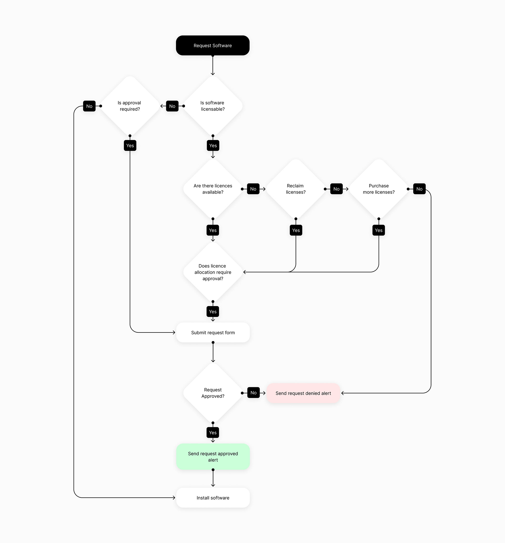
License types include:
Free = No license or cost restrictions
Prepaid = Licence allocation request
Purchase = Purchase licence request
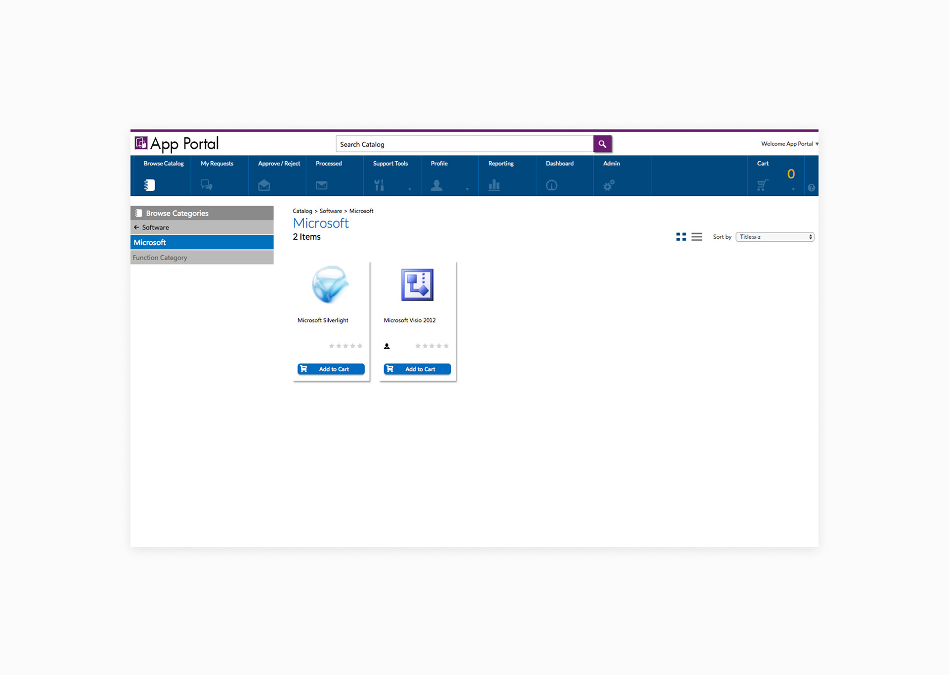
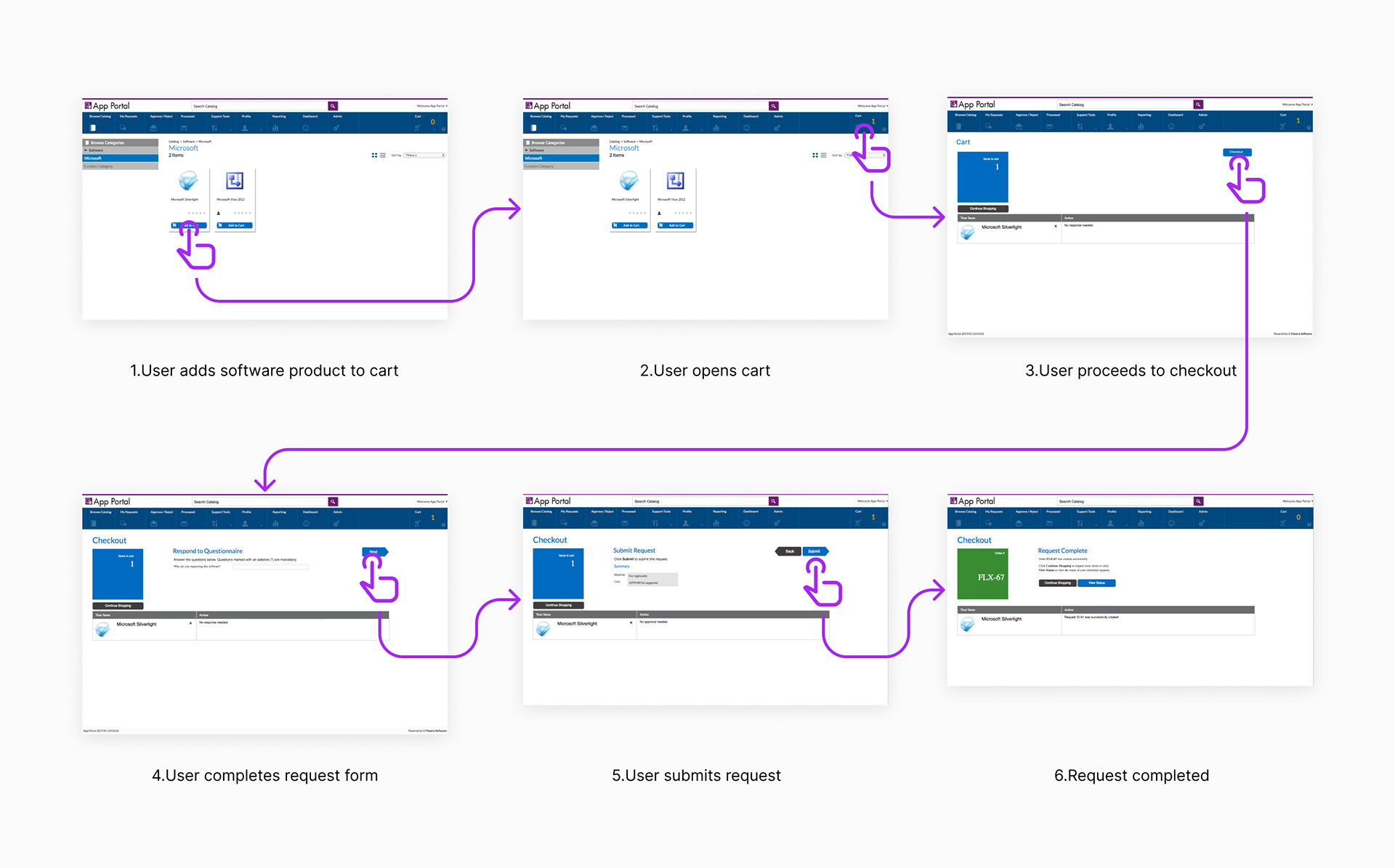
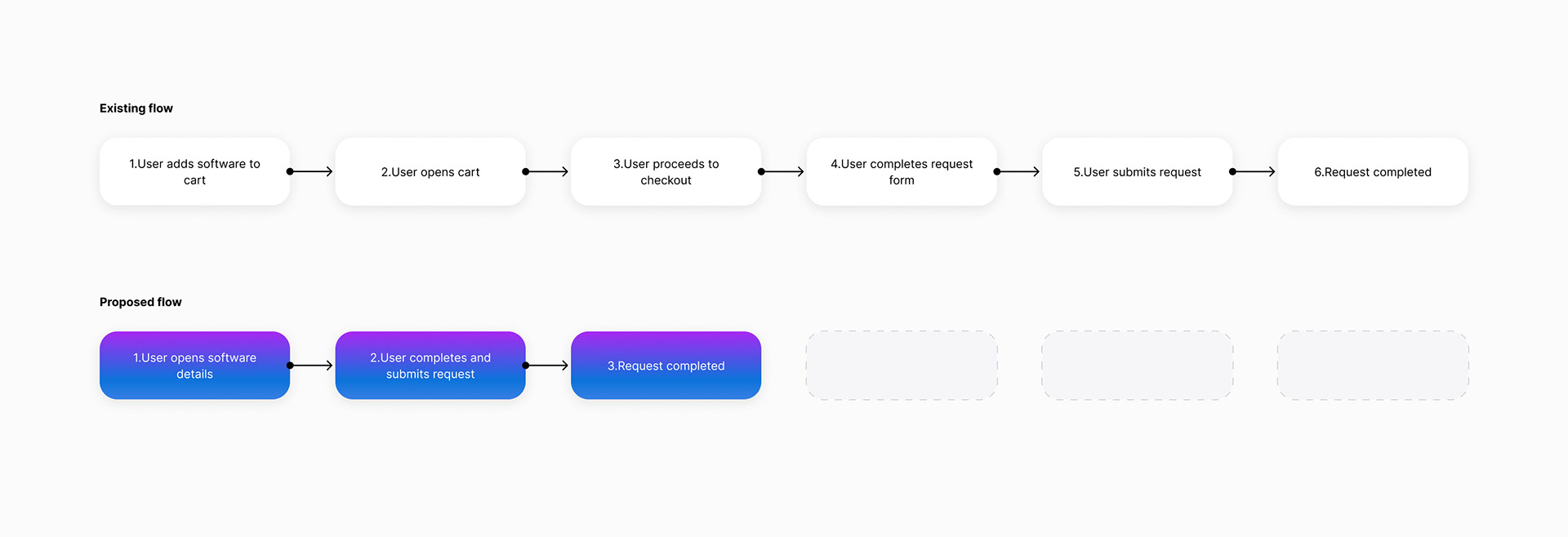
Existing interface request flow
50% reduction in effort
As I analysed the existing request flow, I realised that the flow was not optimal and that users had to go through extra steps that were not needed. Users currently had to go though 6 steps to request a new licensed software application. I felt it was possible to cut this in half and reduce the steps required from 6 to 3, resulting in a 50% reduction in effort.
The license request flow diagram below shows how the cart feature was unnecessary, and how it would be more efficient for users to request an application directly.
Licence request flow
To further validate this approach, I examined the user logs to determine the frequency and number of applications users downloaded. The logs showed that most users downloaded several applications within the first 30 days of joining an organisation, and then they downloaded one application at a time sporadically. Almost all requests after the first 30 days were for one application only.

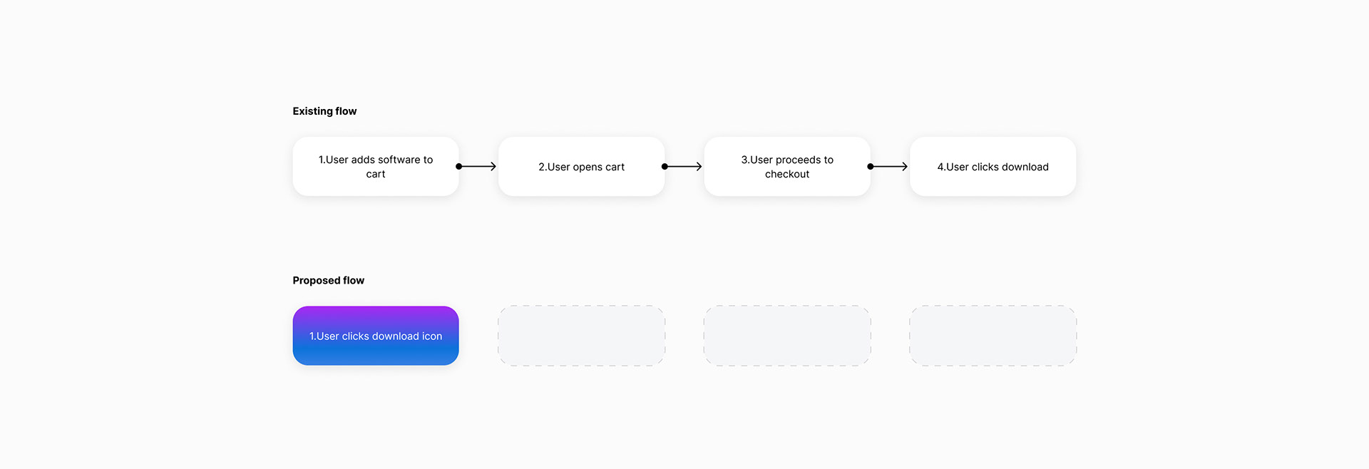
75% reduction in effort with 1 click downloads
The process of downloading free applications that do not require any license or purchase approval could also be reduced from 4 steps to 1, as shown in the free download flow diagram below.
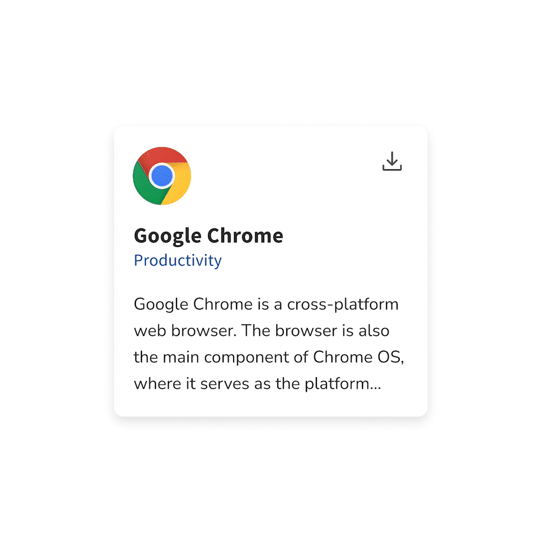
Free download flow
Design Goals
• Simplify request workflows by 50%
• Remove unnecessary features
• Update the UI to bring it in line with Flexera One
— Prototype 1 —
The prototype below shows the new software request flow without the need for a cart feature. Users simply complete the form and submit the request.
User testing
10 out of 10 of users rated this as an easy to use experience
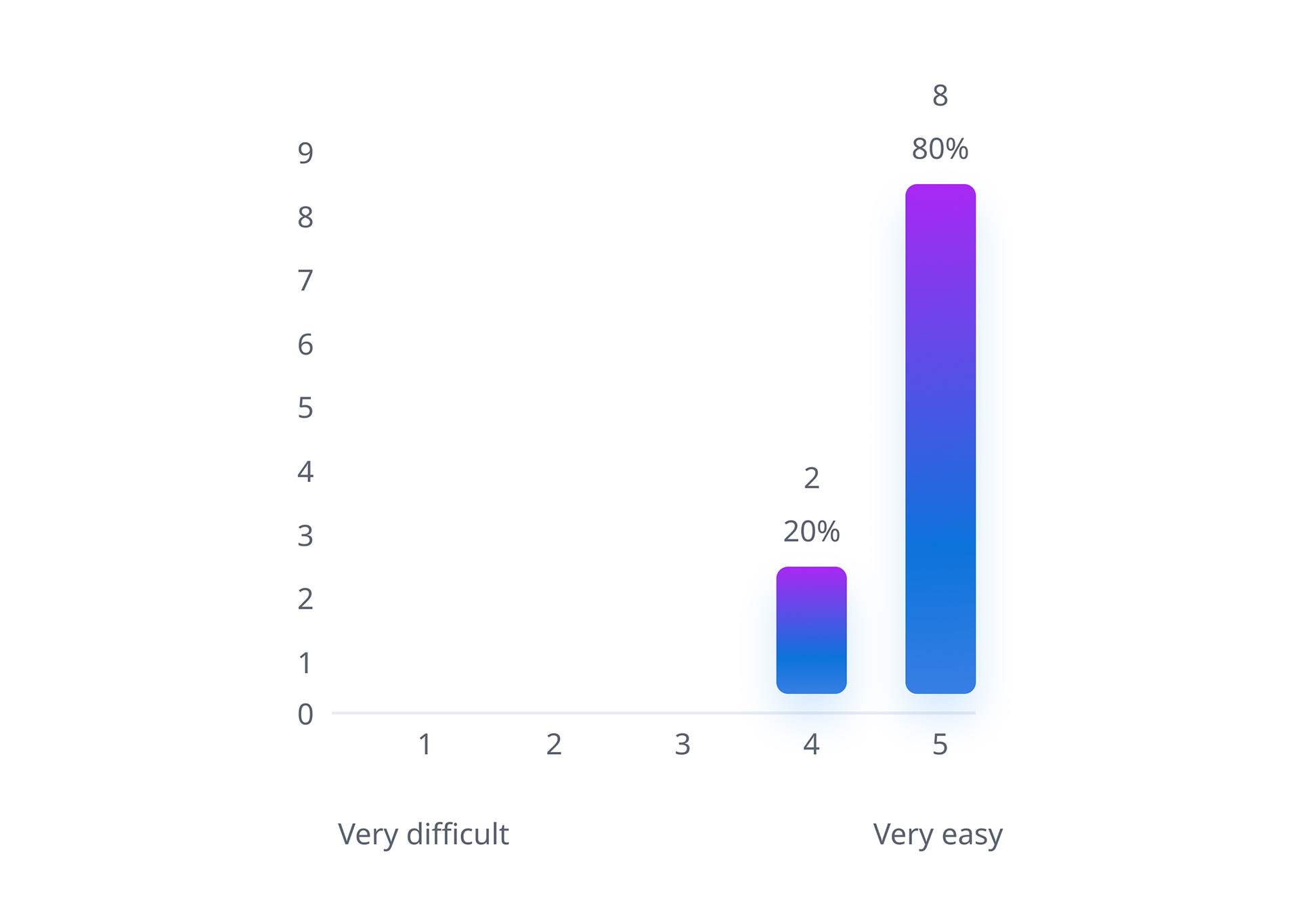

"That's a lot simpler. I never paid attention to the cart since it was just like any other online shopping site. But now that I see this, I realise the cart is not needed."
— Next steps —

Another finding from my research was that app portal had a feature to group users. This enabled organisations to control the access and availability of the applications or hardware each user can view or request based on the group they are assigned to.
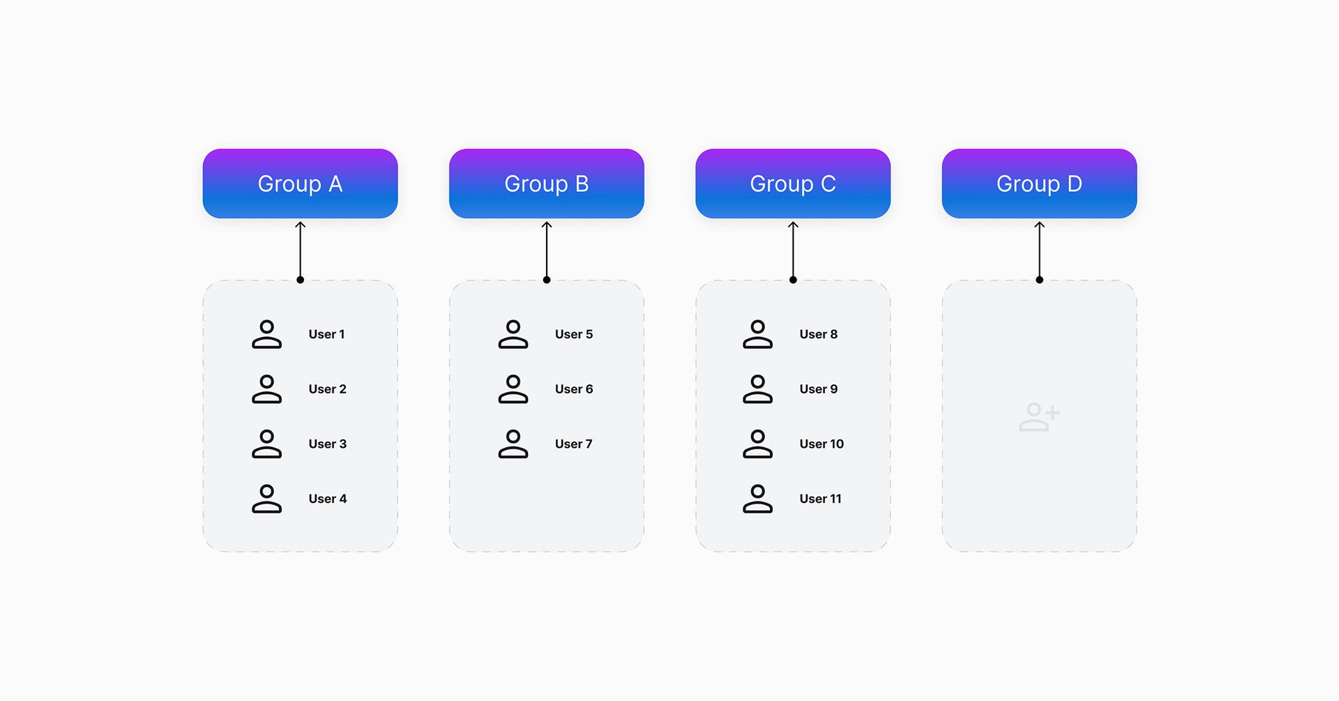
This motivated me to find a way to make it easier for users to find the most relevant and useful applications for their role. As a solution I added a simple filtering feature on the UI that allows the user to customise the view of the applications, and only display a recommended set of options based on their role.
— Prototype 2 —
I conducted user and stakeholder interviews to evaluate the feasibility and desirability of this concept. I asked them to rate the value proposition and the expected impact of the solution on their work processes and outcomes. The feedback was generally positive and supportive of the feature.
User testing
8 out of 10 users rated the feature as valuable
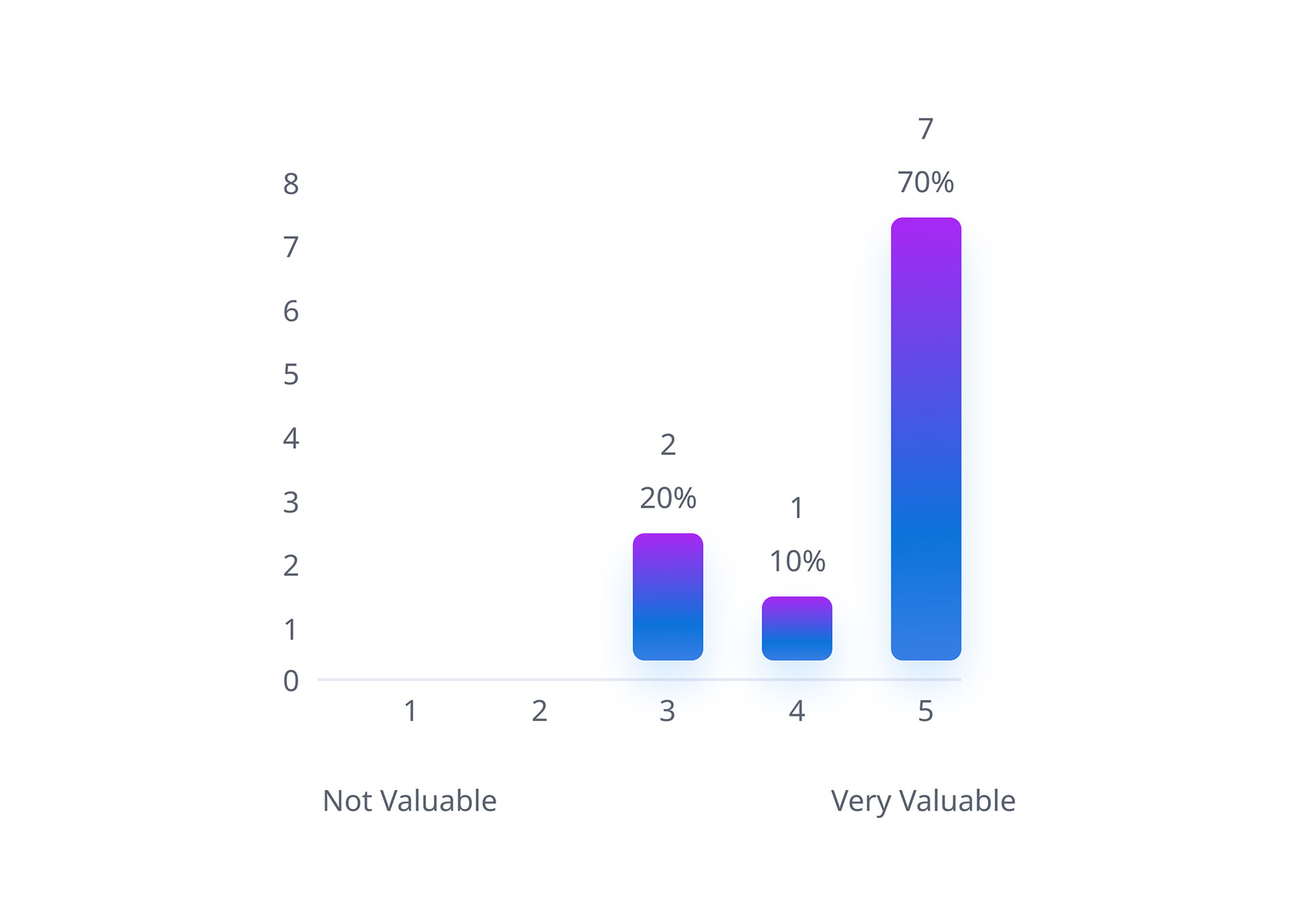
8 out of 10 users felt the feature was valuable and would save them time. Managers in particular felt it would make onboarding easier for new team members.
Many users reported that they frequently contact their co-workers to inquire about the software or hardware they use for their tasks. They felt having a feature like this would increase awareness of tools and reduce inefficiencies as quite often there can be multiple tools to do the same job.
High value, low effort
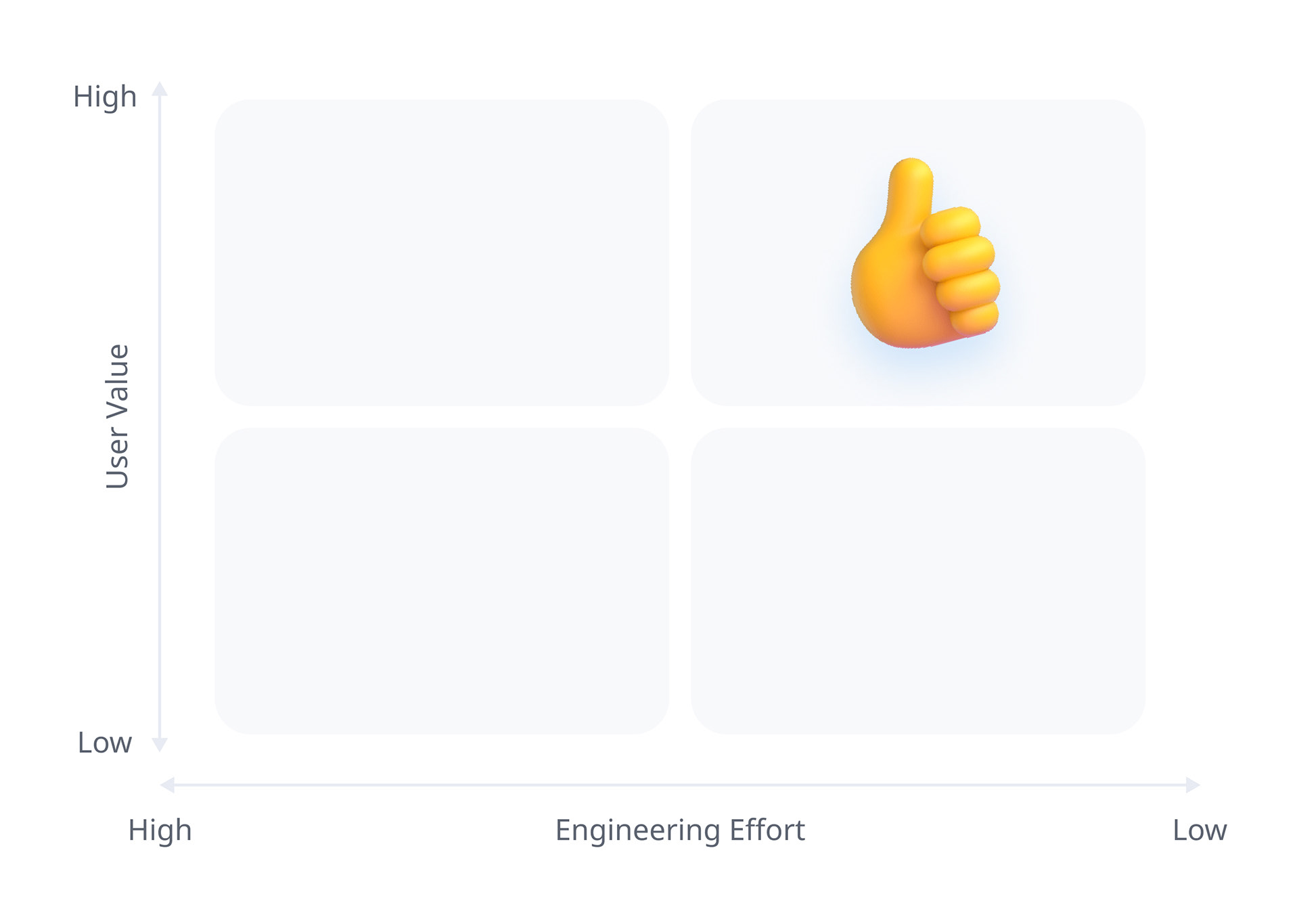
The feature was low effort for the development team to implement, as it only involved adding a new database flag and an extra column to the data table on the user admin screen.
The feature had high scores for user value and low scores for engineering effort, which resulted in it being prioritised for development and release.
— Outcome —

NPS +87pts
Product Net Promoter Score (NPS) jumped from -48 to +39 after launch.
Final application interface
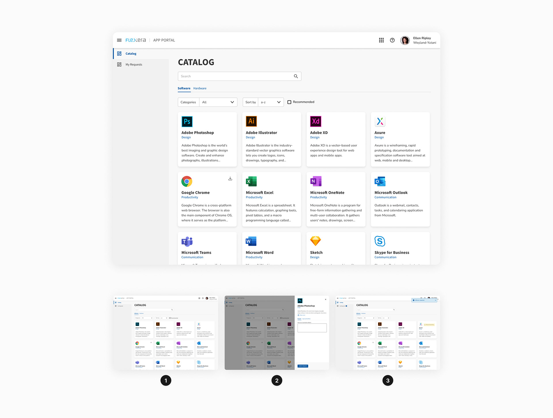
The users were thrilled with the new product experience, as they could complete their requests with a faster and simpler workflow that cut their task effort in half. This was one of the many UX improvements that I implemented across the app, which helped boost users satisfaction with the product. The Net Promoter Score (NPS) showed this clearly, as it went from -48 to +39, a remarkable increase of 87 points.
You may also like