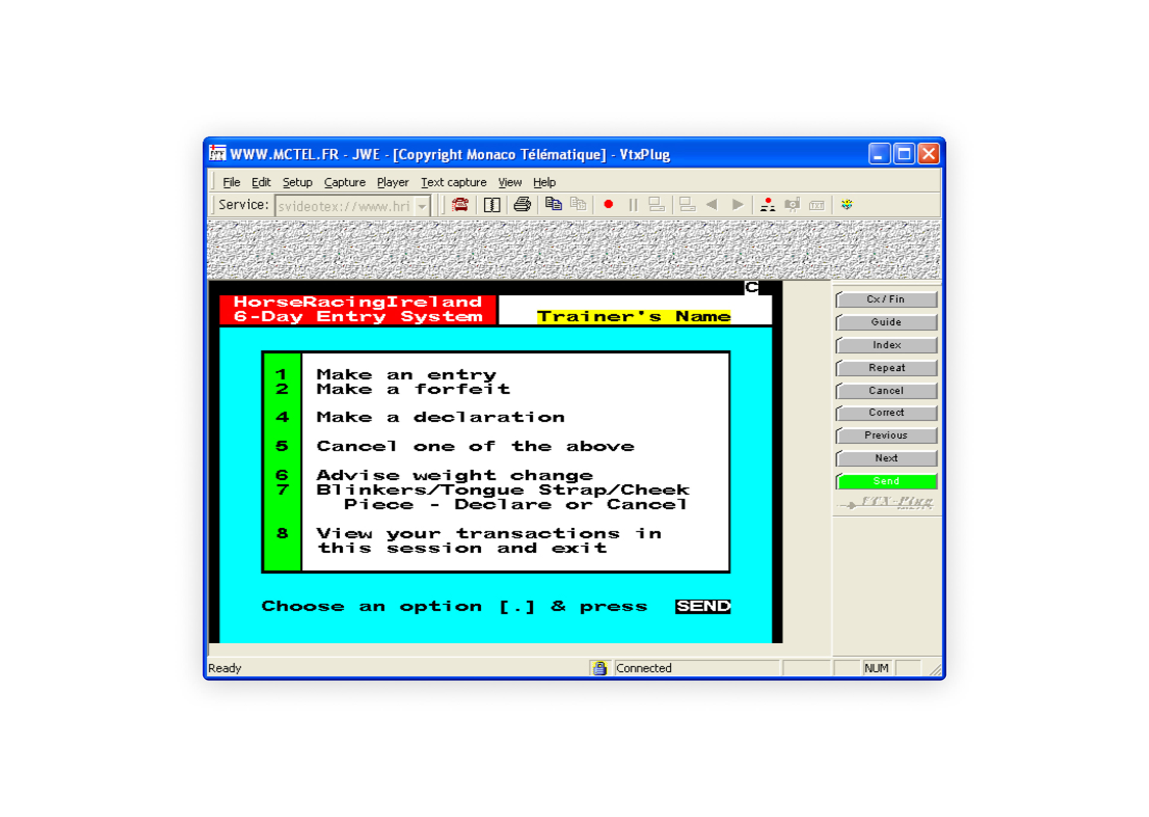
Horse Racing Ireland — Self service responsive web application for horse racing administration
The Problem
The old system of Horse Racing Ireland (HRI) was outdated and inefficient. They wanted a new responsive web application that would enable their customers to handle their racing activities more independently and reduce the workload of the HRI administration team.
I was responsible for
- User research
- Design direction
- Prototyping
- Interaction design
- UI design
— Background —
Horse Racing Ireland (HRI) is the national governing body for thoroughbred horse racing in Ireland. It oversees the annual schedule of races and prize-money for each of the 26 Irish racecourses.
HRI's Racing Department handles all aspects of race administration, including declarations and entries for every Irish horse race. It also produces the Racing Calendar and Form Book, which contain essential information for racing enthusiasts. Additionally, it keeps track of all records related to horse ownership, naming and training in Ireland.
— My Process —
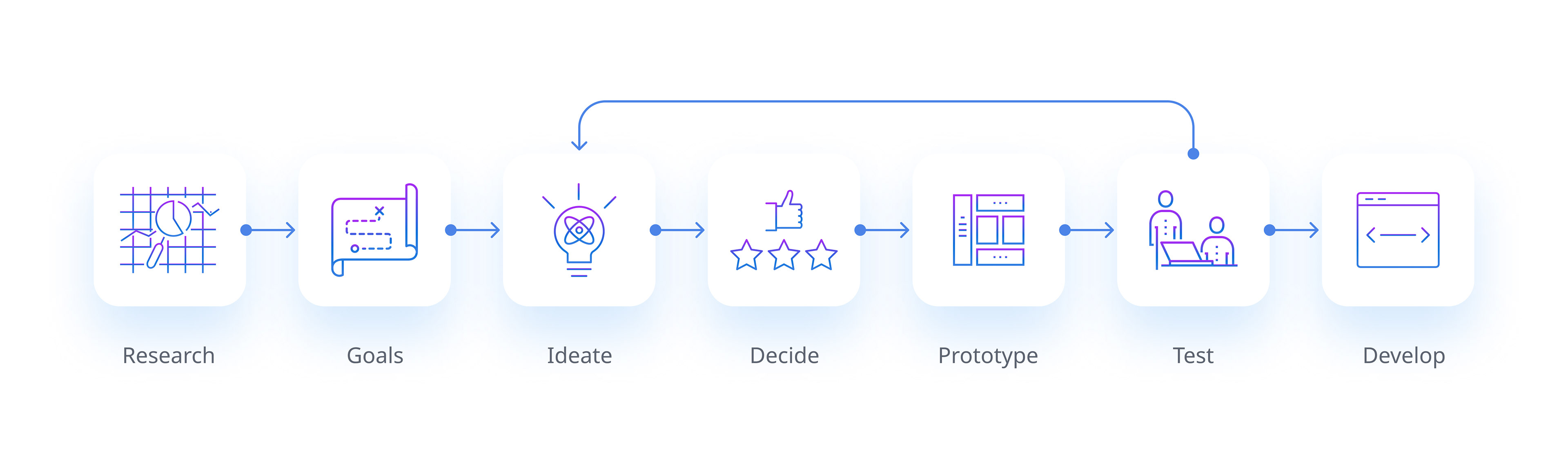
— Research —
To gain a comprehensive insight into the current state of the business, its systems and processes, I applied the following research methods.

Job shadowing
I joined the HRI team for a week to learn about their roles and responsibilities and to witness the various tasks involved in preparing and running racing events.
Systems training
I explored the different software tools and features that the HRI team used to plan, manage and monitor racing events.
Discovery workshops
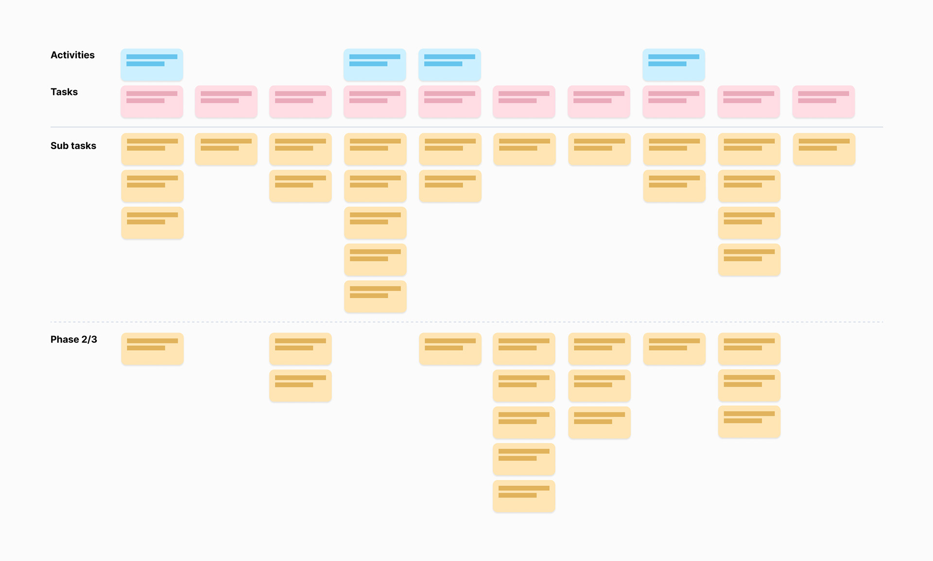
To get a better understanding of the system and customer needs I conducted a series of workshops with the stakeholder team. During which I helped them create a story map for the new system, that mapped out different user's activities, tasks and sub tasks.
The team then ranked the sub tasks in order of importance to create a backlog of system features. These where then sorted into 'must haves' vs 'nice to haves'.
What I learned
• I gained insights into how the team operated on a daily bases and how they collaborated
• I learned about the different types of requests the team handled
• I understood the business processes and rules that guided the team's process and decisions
• I identified challenges and difficulties
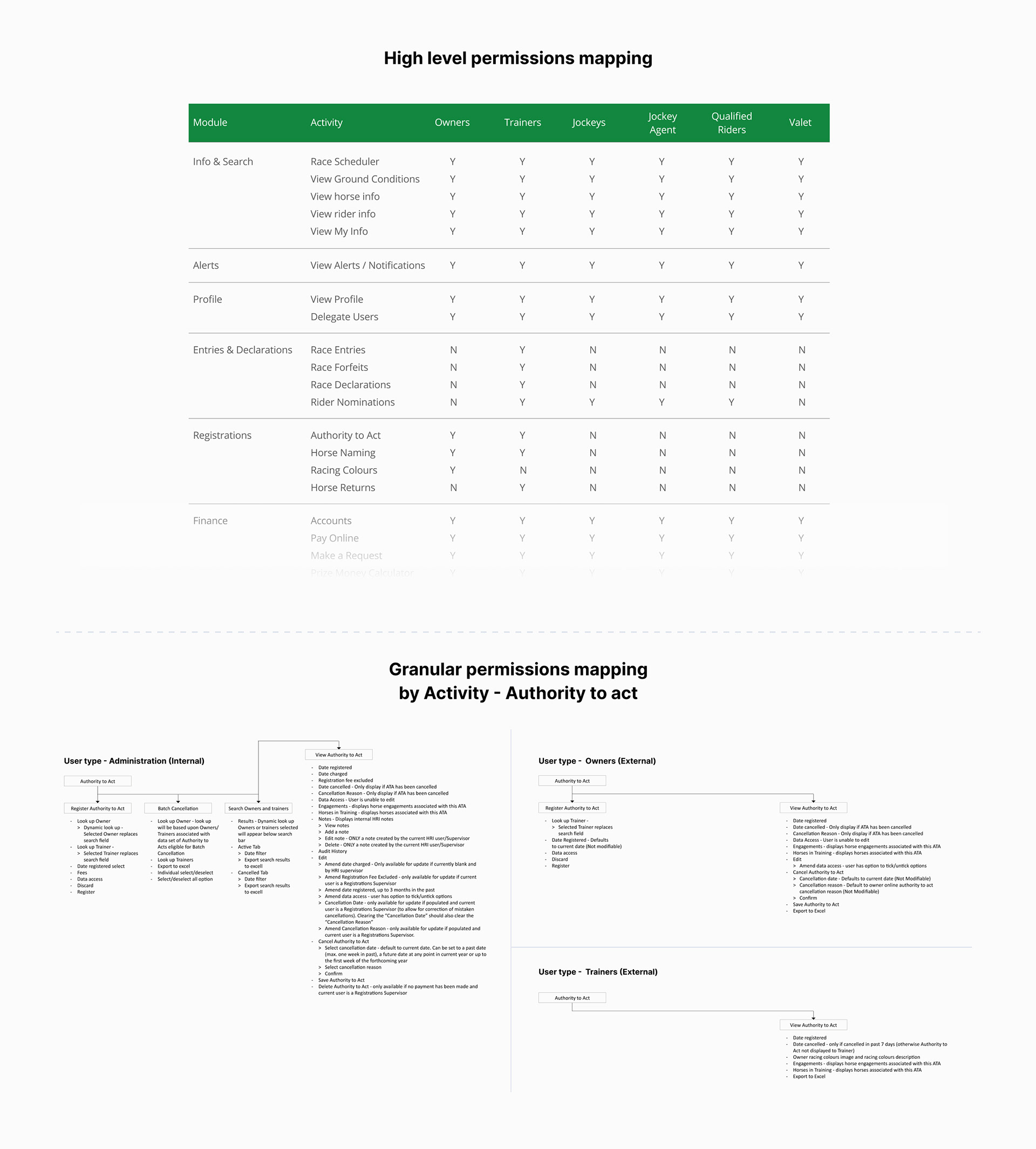
• I learned that HRI has multiple user groups with multiple levels of user permissions
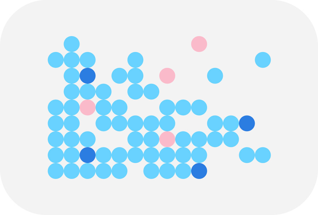
User permissions
The user permissions were a key factor in designing the UI, as they determined which features would be visible or hidden for different users. This also had implications for the individual screen layouts, as the UI had to accommodate various scenarios of feature and function availability. Below is an example of the permission groups and their mappings.
Design Goals
• Enable users to complete racing administration tasks on mobile, tablet and desktop devices
• Create an adaptable UI structure that can hide and show features and functions
• Reduce the reliance on phone in services with web browser self-service functionality
• Streamline workflows to reduce delays and errors
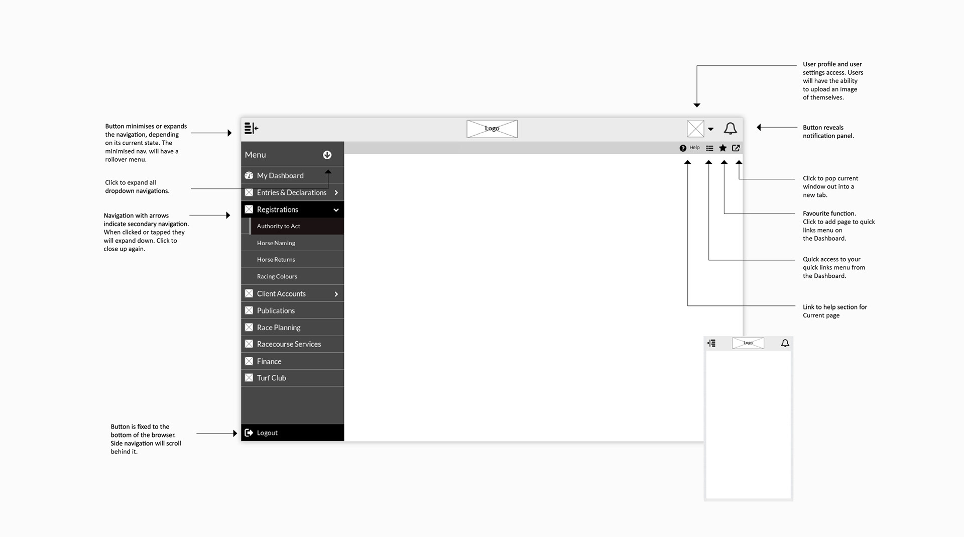
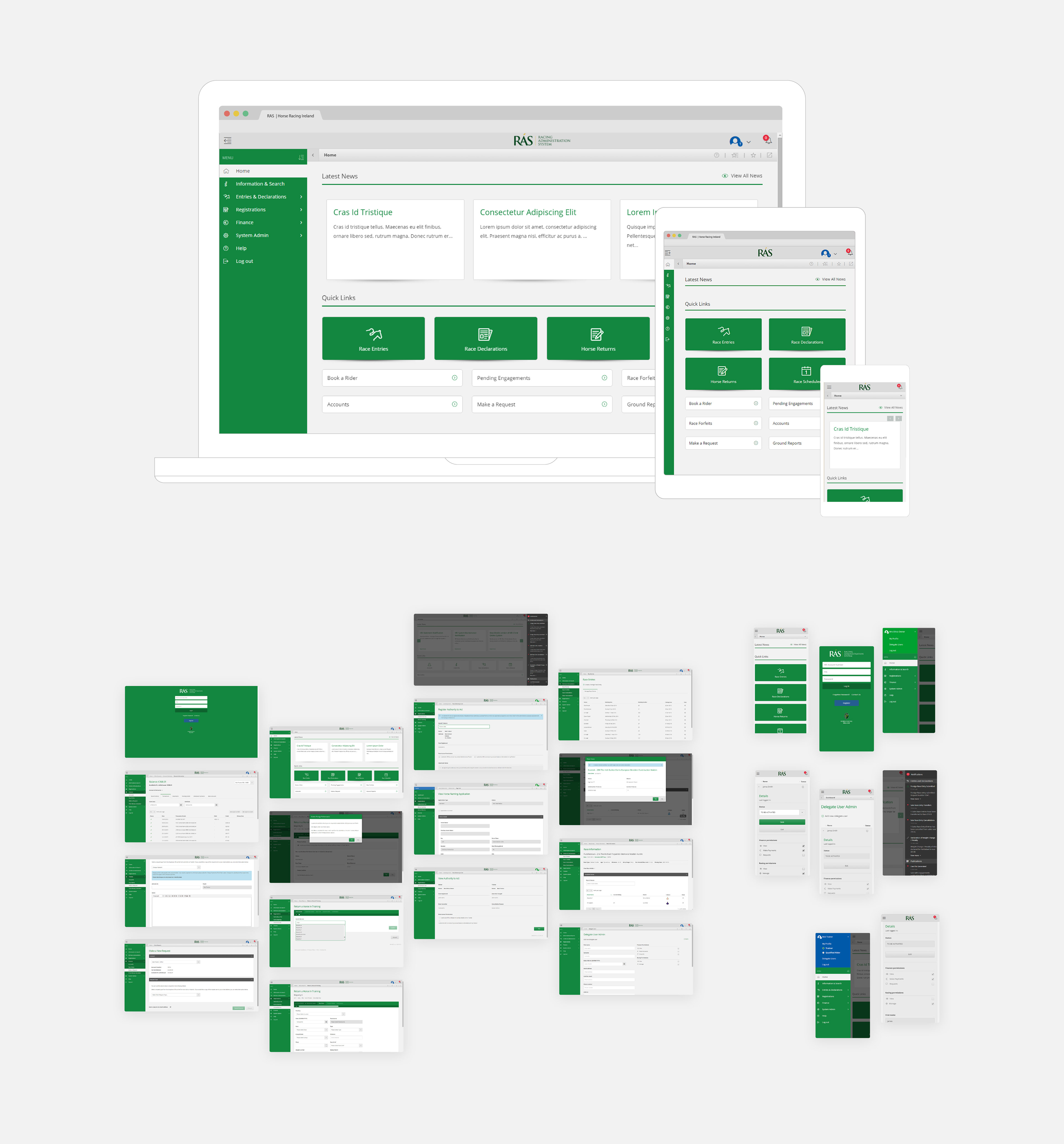
— Interface shell —
As a foundation, the system needed a responsive interface shell that would enable users to navigate and access system functions on mobile and desktop devices.
To achieve this, I organised an ideation workshop where I shared my insights from my job shadowing analysis and we reviewed some applications that the stakeholders liked and wanted the new system to emulate.
To achieve this, I organised an ideation workshop where I shared my insights from my job shadowing analysis and we reviewed some applications that the stakeholders liked and wanted the new system to emulate.
I then divided the team into groups and asked them to brainstorm some interface ideas. The team then voted on the best ideas from each group, and I used these ideas to create some low fidelity mockups that I could test with users.
This was then iterated on until I found a solution that the stakeholders were happy with.
Job Shadowing observations
One of the main goals of my job shadowing experience was to identify usability features that could enhance the user experience and speed up the user's workflow. Based on my observations, I came up with the following usability enhancements:
New browser tab
One of the challenges faced by the administration team was the need to switch between different system pages to perform various tasks at the same time.
To improve efficiency I developed a new feature that would enable users to open multiple system pages in new browser tabs. This way, users could easily navigate between different functional areas without losing their current page.

Favourites menu
I observed that different team departments accessed specific system pages more frequently.
To improve efficiency, I implemented a favourites feature that enabled users to bookmark any system page and create their own custom navigation.

User testing
The internal users were very satisfied with both of these features and rated them as high value. As a result, the stakeholder decided to incorporate them into the main system shell.
— UI Styling —

The interface styling was a contentious issue among the stakeholders, who had different preferences for the colour scheme. Some wanted a dark theme, while others preferred a bright and colourful one. To help guide the group to a decision, I organised a UI workshop, where we discussed HRI's brand guidelines and various UI styles. The team then voted on the ones they liked best. Based on the stakeholders feedback, I created several style options for them to review and vote on.
I then refined these ideas to comply with AA accessibility standards and HRI's brand identity. This led to a UI design that satisfied everyone's expectations and did not compromise the usability of the system.
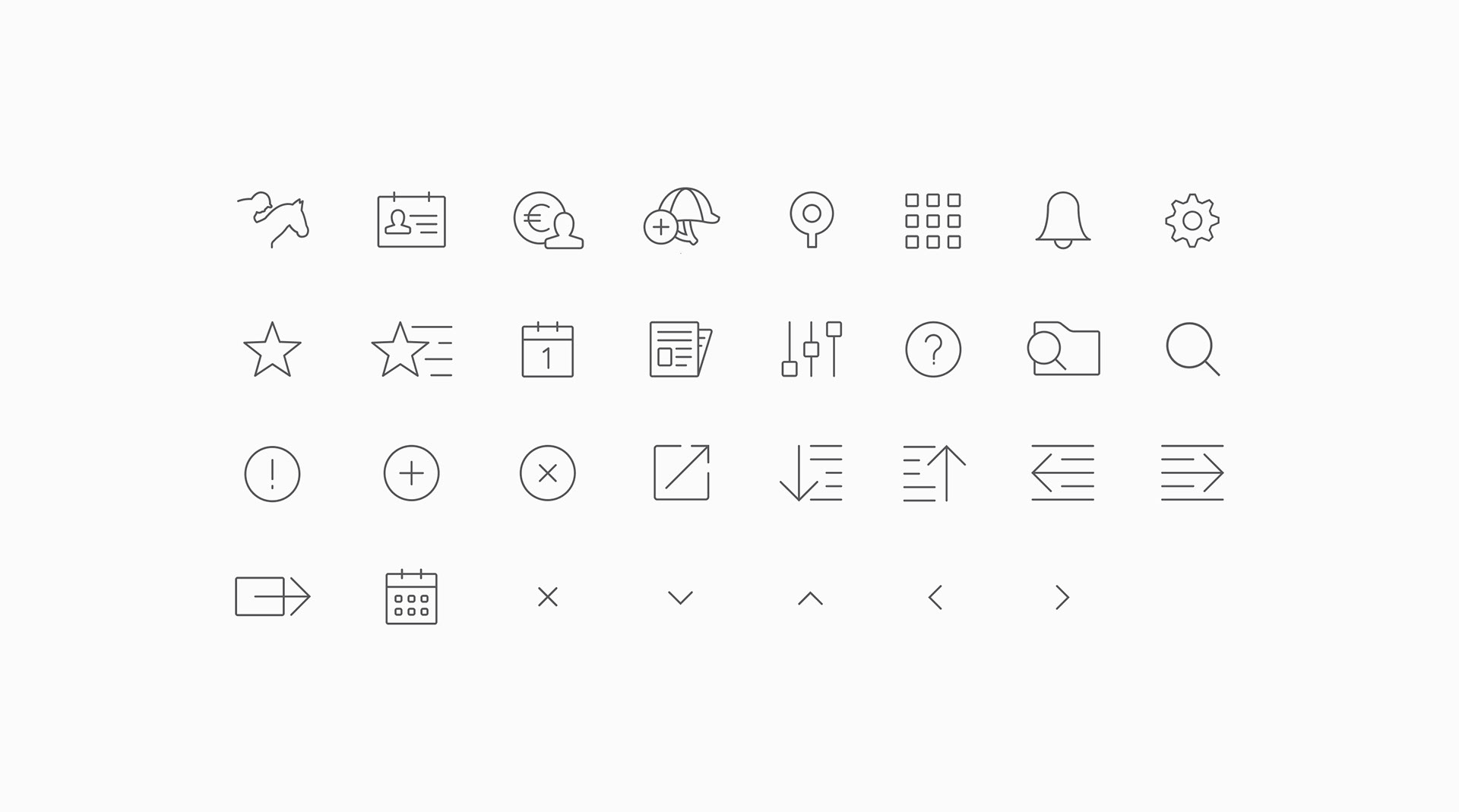
Iconography
The HRI project required custom icons for its specific features. I collaborated with the HRI team to create and select different icon options. I used adobe illustrator to draw the icons and made changes based on the feedback. The final icons were converted into a font for the system development.
— Final UI Design —
To evaluate the impact of the new UI style on the user experience, I asked the development team to build a working prototype of the interface shell in code.
I then conducted a usability testing day with users, where I asked them to complete some tasks using the prototype on mobile, tablet and desktop devices. I observed the outcomes and collected feedback.
Prototype for testing
User testing
The feedback was largely positive however there where some usability issues that needed addressing
• UI elements on mobile devices were too close together, making it difficult for users to tap the right thing
• The swipe to open navigation didn’t always work
• Some components did not function correctly on android and windows devices
• Users did not like how the data grids worked on mobile devices

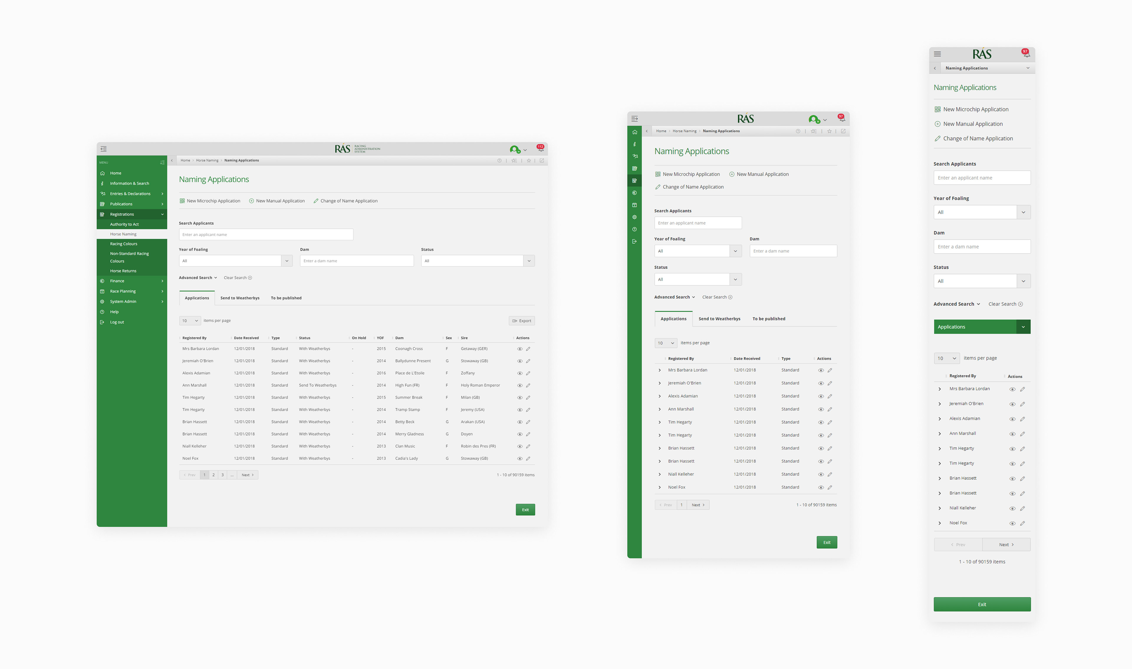
— Mobile Data Grids —
During the testing session the system's design was discussed in detail and I realised that data grids would play a key role in presenting the information to the users. Data grids offered the best way to display the data needed. Below is an example of the proposed mobile grid layout.
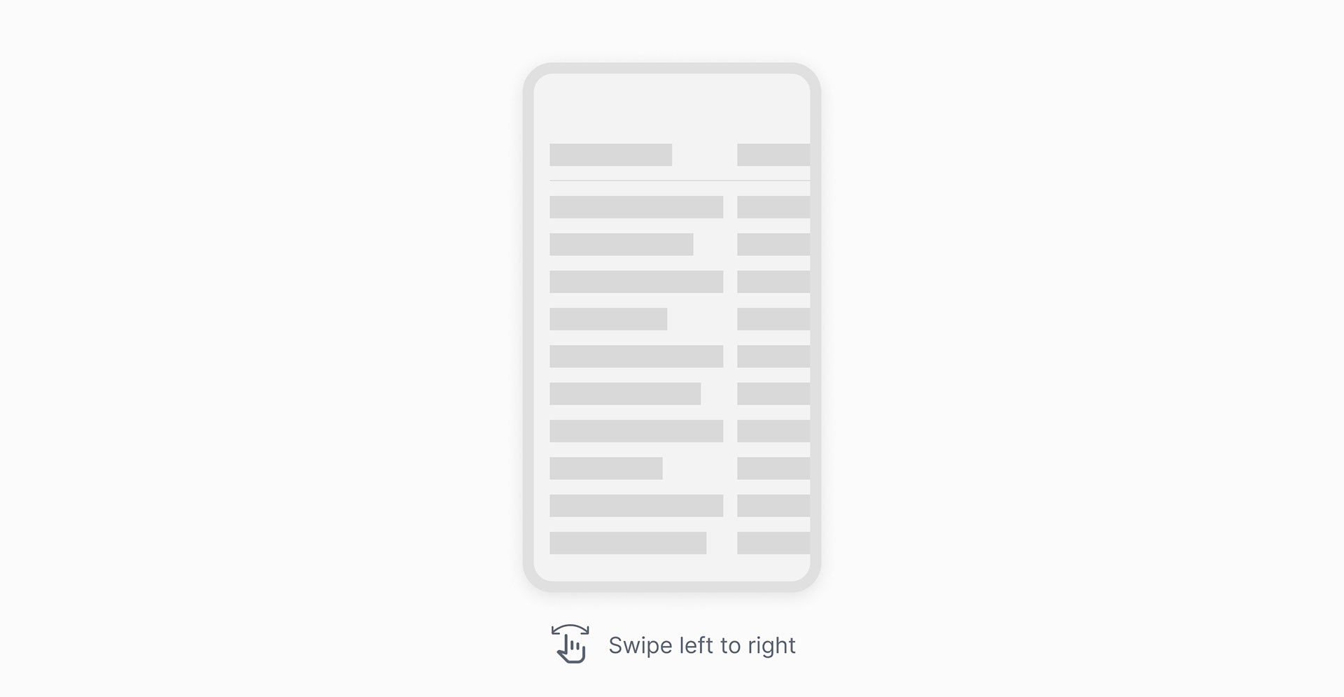
However, one of the challenges of designing data grids for mobile devices is the orientation of the screen. Data grids usually have a primary column that contains the parent information, and other child columns that provide related details. On desktop devices this is easy to see because the screen is wide enough to display all or most of the columns. However, on mobile devices when the screen is in portrait mode, which is the preferred way of using them, the screen width is greatly reduced making it impossible for users to see the relationships between the parent and child columns.

7 out of 7 users expressed frustration with the mobile data grid experience.

Idea 1
One idea was to make the first column of the data fixed. However, this was not suitable as the data being displayed in some columns would take up a large portion of the screen, preventing the user from scrolling across and reading the content in the other columns.

Idea 2
Another was to allow the data in the rows to wrap onto multiple lines. However, in testing this was found to be undesirable by users as it made the interface look messy and unprofessional. Users also felt it was difficult to retain the connection to the parent data, as they quite often forgot which row they were reviewing.

Idea 3
I also explored the possibility of stacking the data columns vertically per row. However, when I tested this with users, they did not like the amount of scrolling required in order to view different row records.
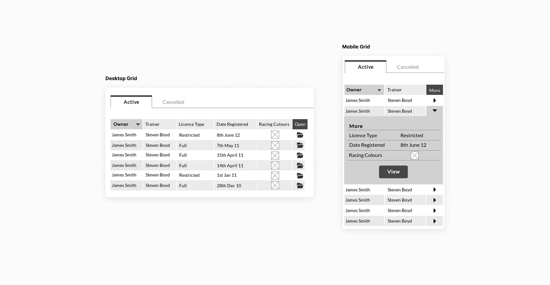
Final Solution
As a solution to this problem I design an alternative responsive approach. As the user's screen size reduces, data columns will collapse into the row. The user can then access the data by expanding the table row. This approach takes advantage of the portrait screen height and enables users to retain more context.

User testing
When testing, all users expressed their delight with the new solution and gave it a thumbs up for development.
— Module Design —
Once I had the interface shell signed off I was able to move on to designing the modules that the team had identified and prioritised in the story mapping exercise. I approached these in order of priority starting with mapping out the information architectures/user flows and then moving on to prototyping and iterating on the designs based on user testing.
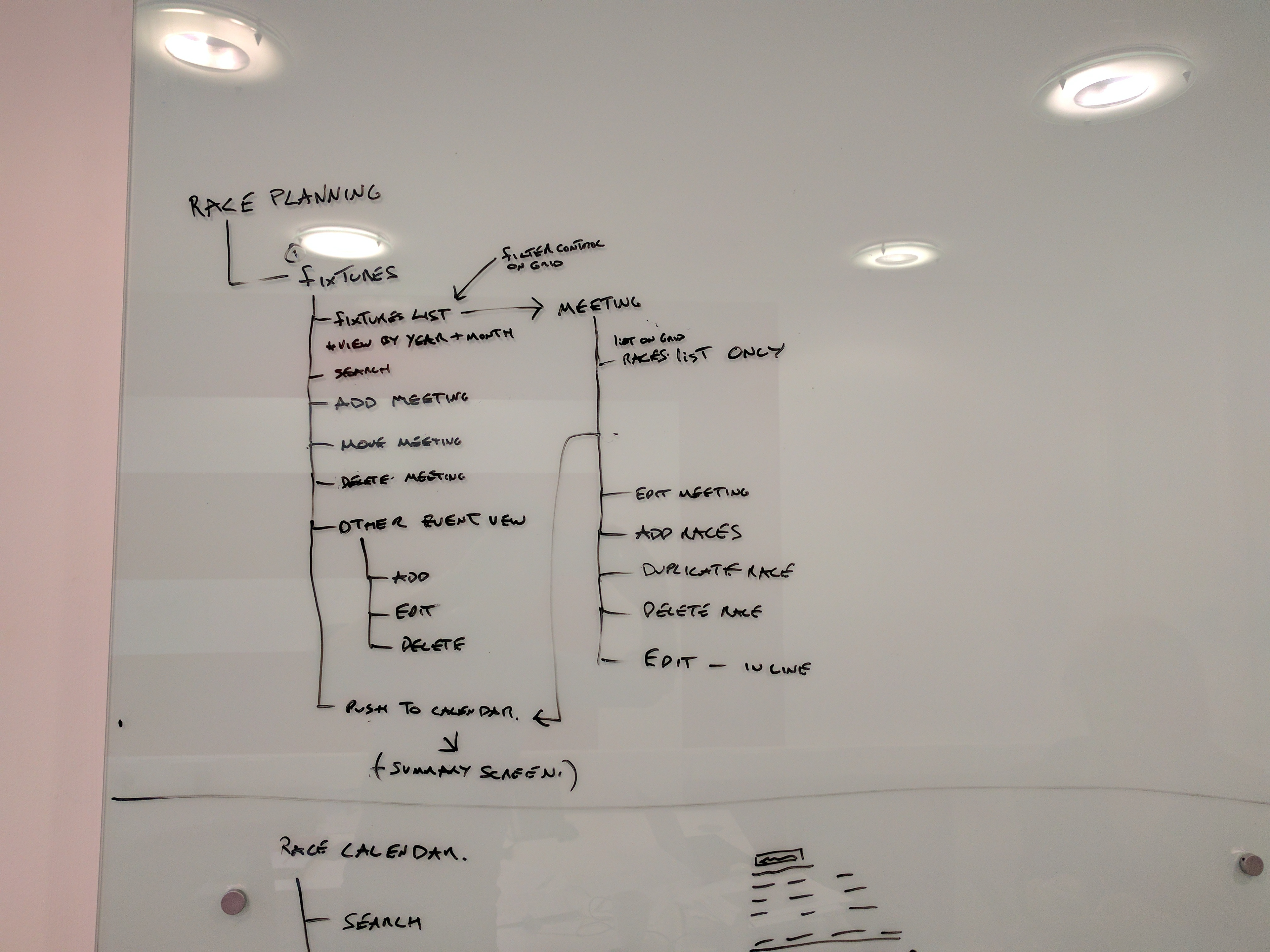
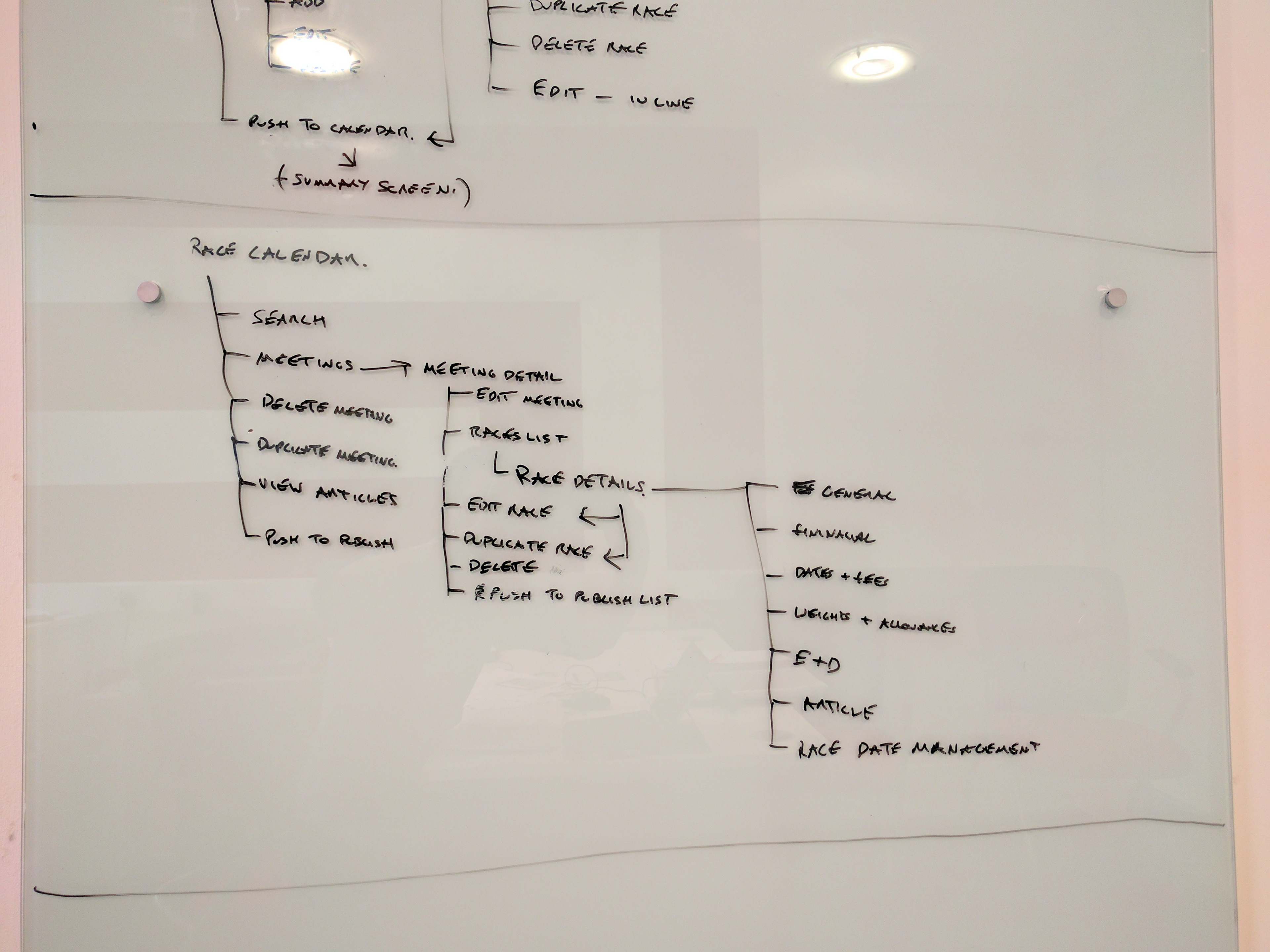
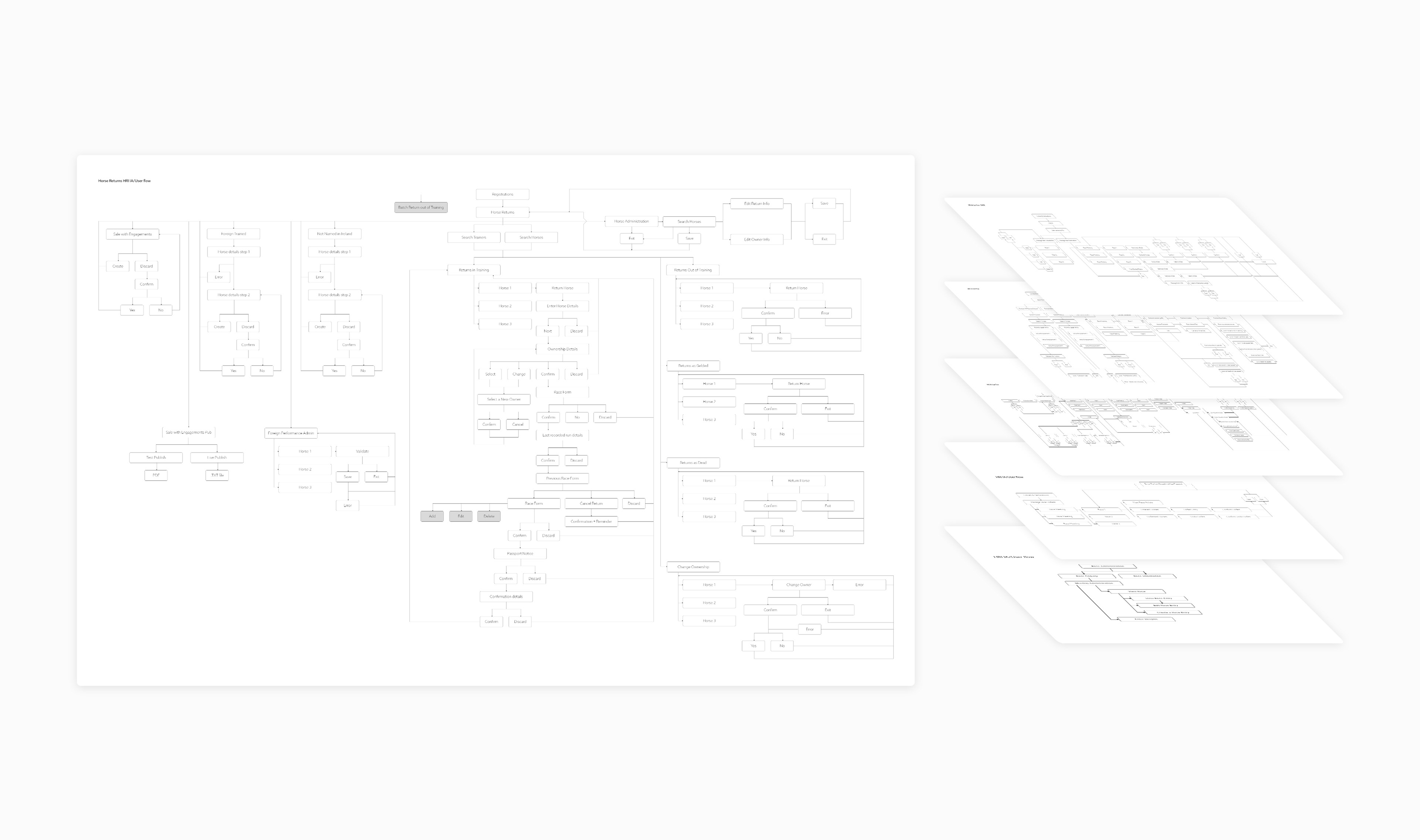
Information architectures
Below is a small sample of the work completed
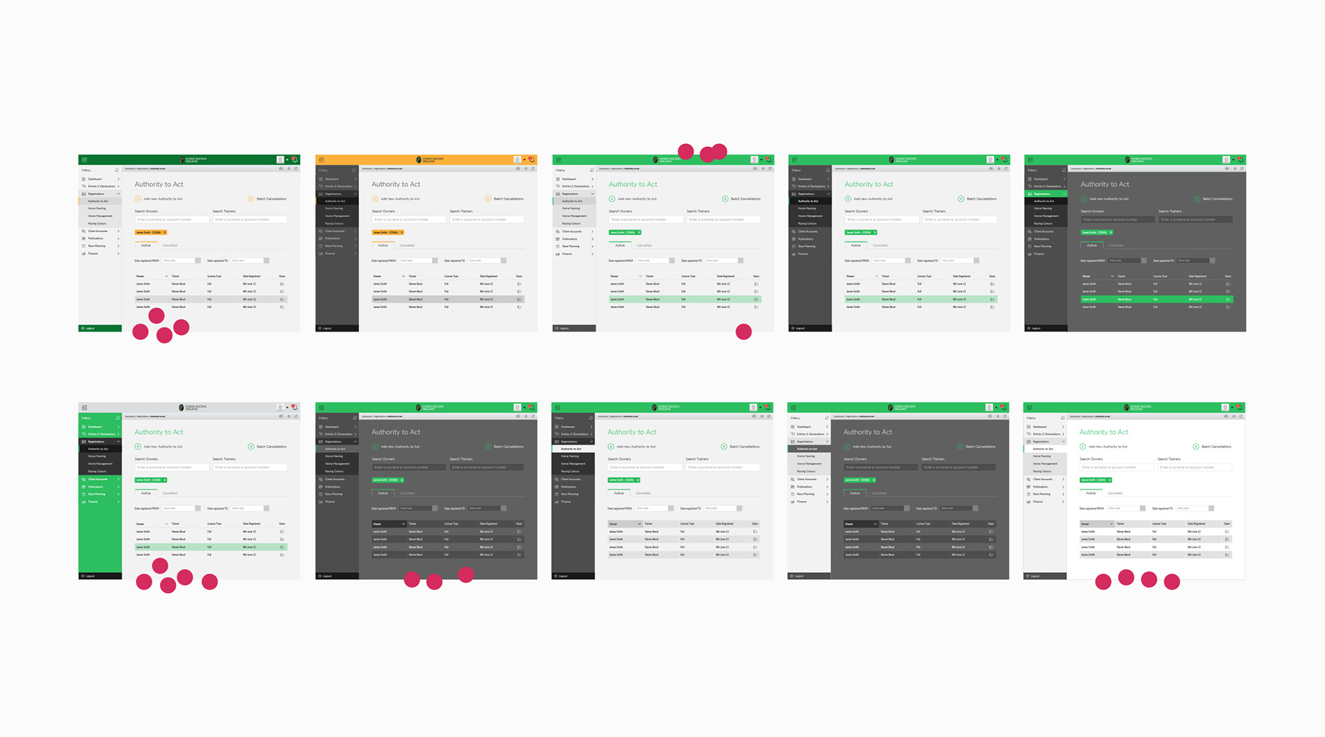
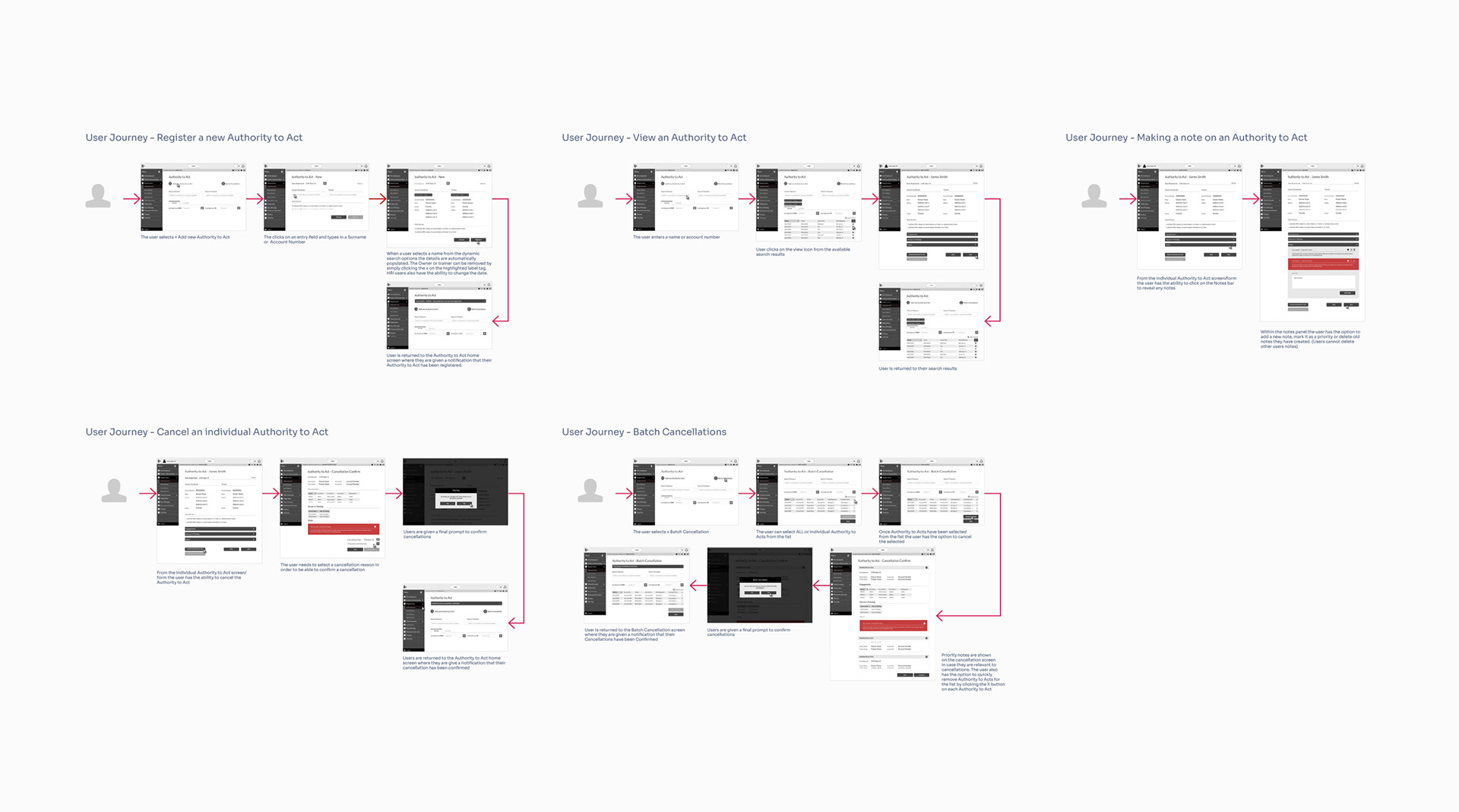
Low fidelity prototypes
Below is a small sample of the work completed
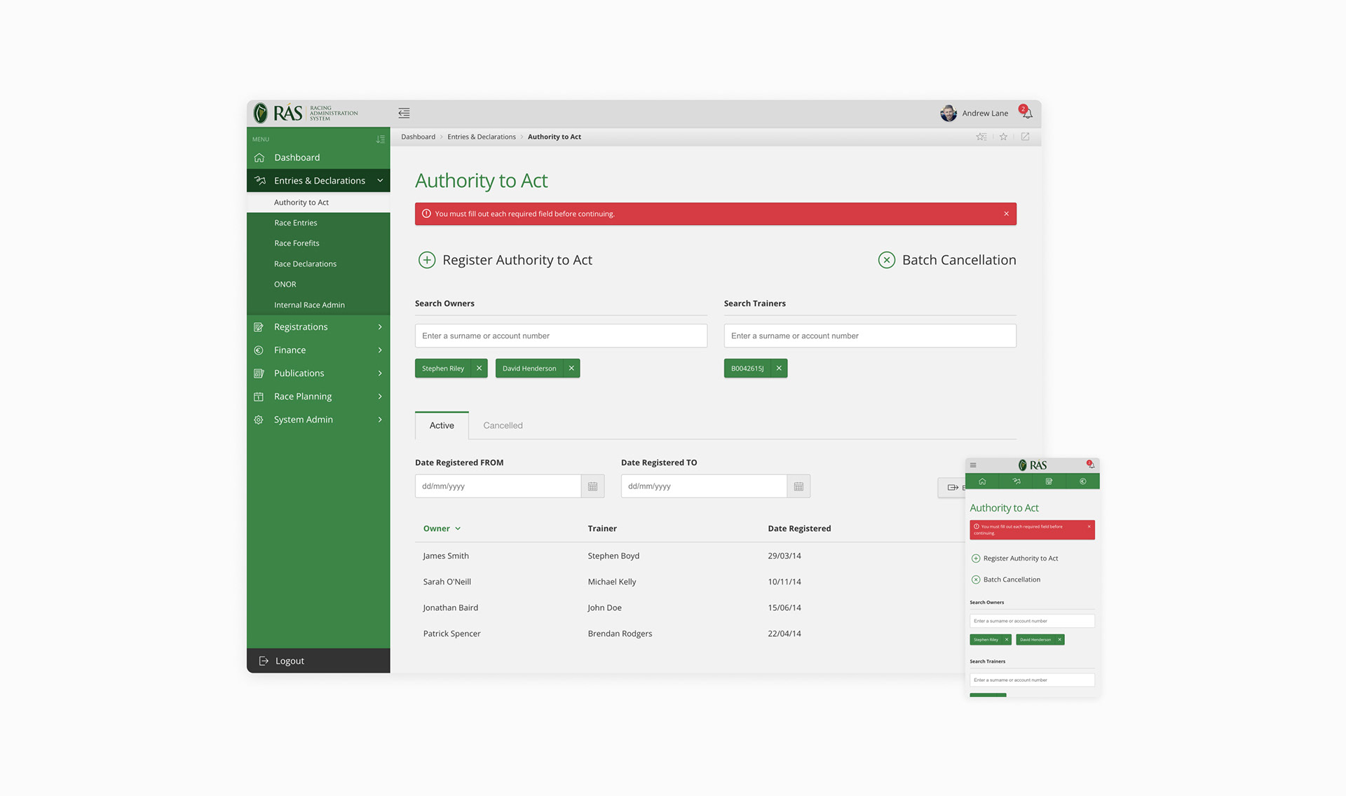
High fidelity mocks
Below is a small sample of the work completed
— Development —

When engineering released the first module for UX review I was shocked by how bad it was...
The interface styles, spacing and interactions were not consistent throughout the project. In order to understand what had gone wrong, I spoke to the Project Manager and Head of Engineering to discuss the UX issues and get a better understanding of the processes that had been followed.
I underestimated the engineering scale of this project
I quickly realised I had underestimated the engineering scale of this project and the risk for my designs to be misinterpreted or overlooked. It turned out that a lot of the developers worked directly from functional specs which only contained screenshots of my prototypes. Some of the developers on the project were unaware there were prototypes available, which indicated there were also communication problems.
The solution
This project was challenging in terms of the scale, complexity, and high collaboration requirements with engineers. I needed a better way to ensure interface consistency and team efficiency. My solution was to create a design system with coded components that would guide the design and development process. This would make production faster and more consistent across the system development.
This however was a challenging task, as I had to persuade our senior leaders to approve some extra funds for developing a design system, which was not part of the original contract scope.
— Design System —
Defining components and patterns
In order to define components and patterns I revisited the first module designs and extracted all the components and patterns being used. I then looked for opportunities to consolidate components and patterns.
To ensure consistency and compatibility across the system, I consulted with the backend engineering team about the technology libraries they were using. I then collaborated with the frontend engineers on my team to create a unified design system that had the same behaviours and styles for all components.
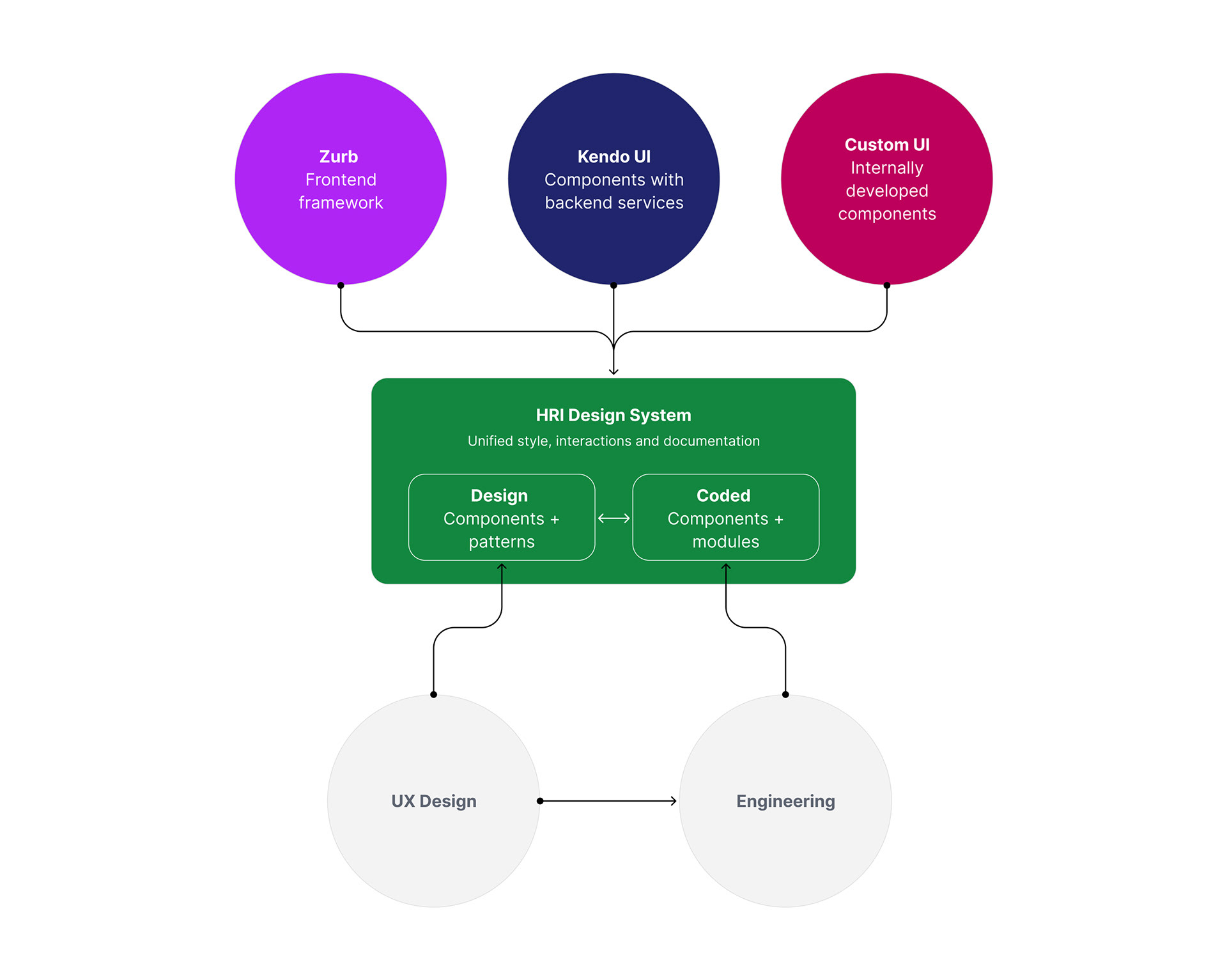
Technical structure
The diagram below illustrates how the team leveraged off the shelf technologies. I unified these to deliver a consistent style and interaction experience.
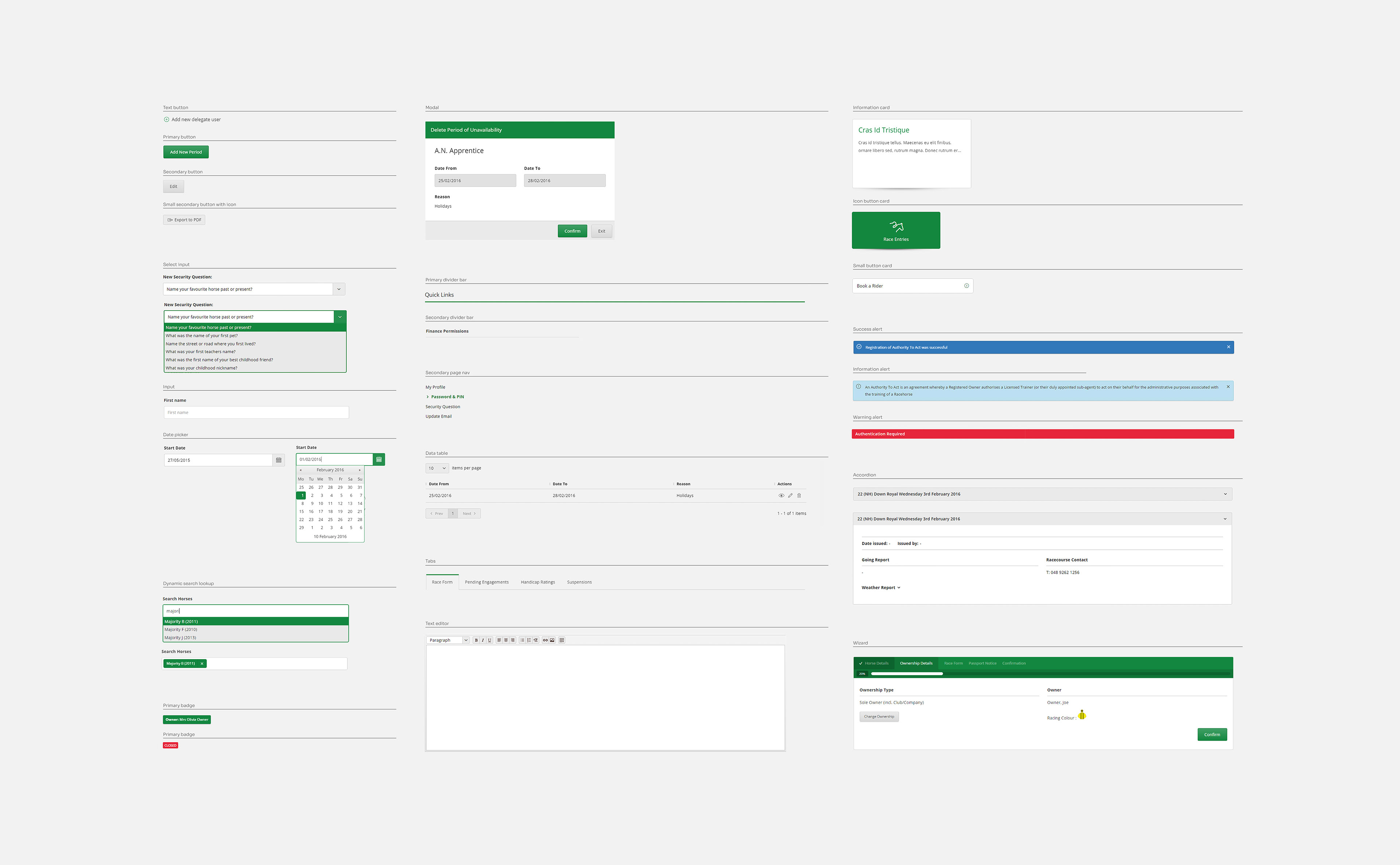
Components and patterns
The image below is a small sample of the components and patterns that were created. They were hosted on an internal website that provided the entire team with access to the live components and the required documentation to use them. The same library was duplicated in the design software.
82% reduction in design defects
The design system had a significant impact on the quality and efficiency of the interface development. The next release had 86% fewer interface defects than the previous one, and the engineering team reported a 38% increase in their productivity based on the hours they logged.
— Onboarding —
HRI's external users had varying levels of technical skills. This new system was very different from the old phone and Minitel services they were familiar with. I was concerned the new system might be a steep learning curve for them, which could lead to negative feedback and bad press for HRI and Etain.
In order to reduce this risk, I proposed that we develop educational materials to facilitate user adoption. I prepared a plan and presented it to HRI, who recognised its worth and approved more funds to produce the following:
• Online help guide
• Training videos
• Printed user manual
I was responsible for the design and production of all three of these items.
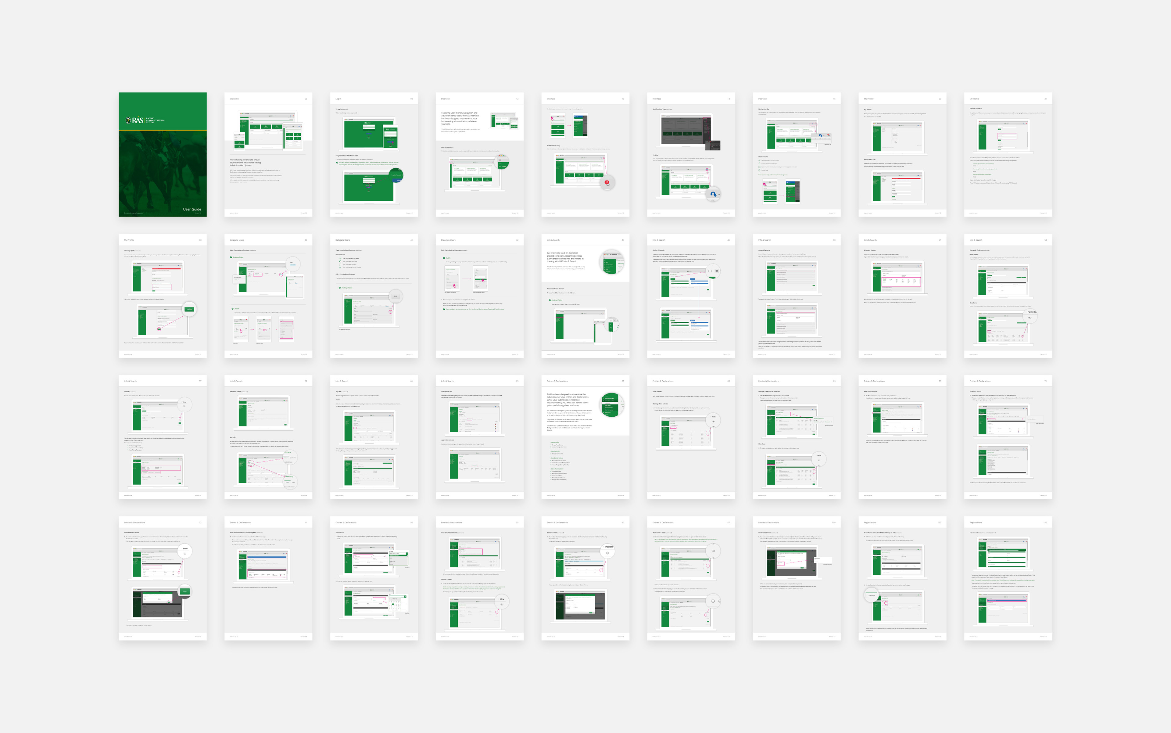
User manual & online help
Below is a small sample from the documentation and system guide that I created. It covers more than 200 pages and explains how to use the system effectively. The same content was also used to populate the online help guide, which users can access directly from within the system.
Training videos
I was also responsible for producing 10 training videos for the new system that covered the core functionality of the system. I created the storyboards, gave art direction, and hired a team of professionals to write the script, record the voice-over, and design the multimedia elements. Here are two examples of the videos I delivered.
Welcome to RAS
RAS Overview on mobile
— Outcome —
Upon launch internal and external users expressed a lot of delight with the system, with the following feedback being publicly posted on twitter:

@HRI_Racing the new RAS system is second to none, Brilliant
Michael O’Callaghan
The new @HRI_Racing RAS system has a great look and very easy to use, well done
Supreme Horse Racing
Just had a demo of the new @HRI_Racing RAS system - so simple & user friendly, huge credit to all involved in its development
Meta Osborne

83% drop in phone-in services
The new system had a positive impact on the phone services of the HRI team. In the first quarter of its implementation, the phone calls decreased by 83%, which allowed the team to allocate more time to higher-priority tasks and projects. The team was more efficient and their productivity increased thanks to the new self service system.
You may also like