
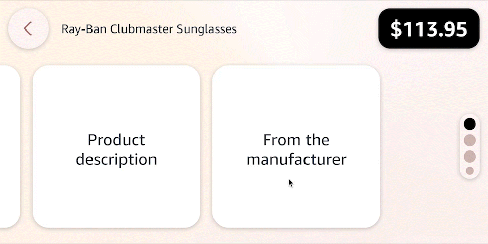
Hub shopping UX — An improved touch experience.
The problem
Voice enabled hub devices had low shopping engagement compared to mobile devices. The product team learned from user feedback that the Hub's shopping experience was not user-friendly. Users said voice commands were slow and hard to remember, and touch navigation was clunky and confusing, in comparison to their mobile with offered a superior experience.
I was responsible for
- User research
- Design direction
- Prototyping
- Interaction design
- UI design
— My Process —
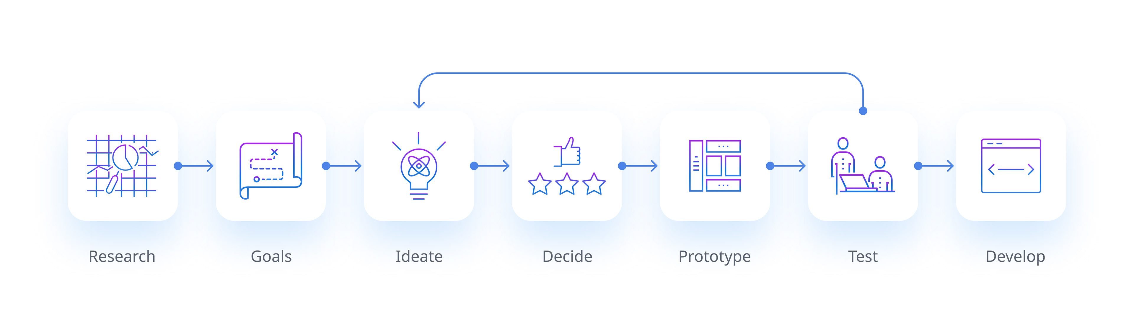
— Research —
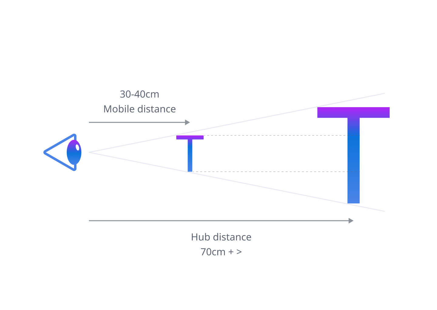
Device usability
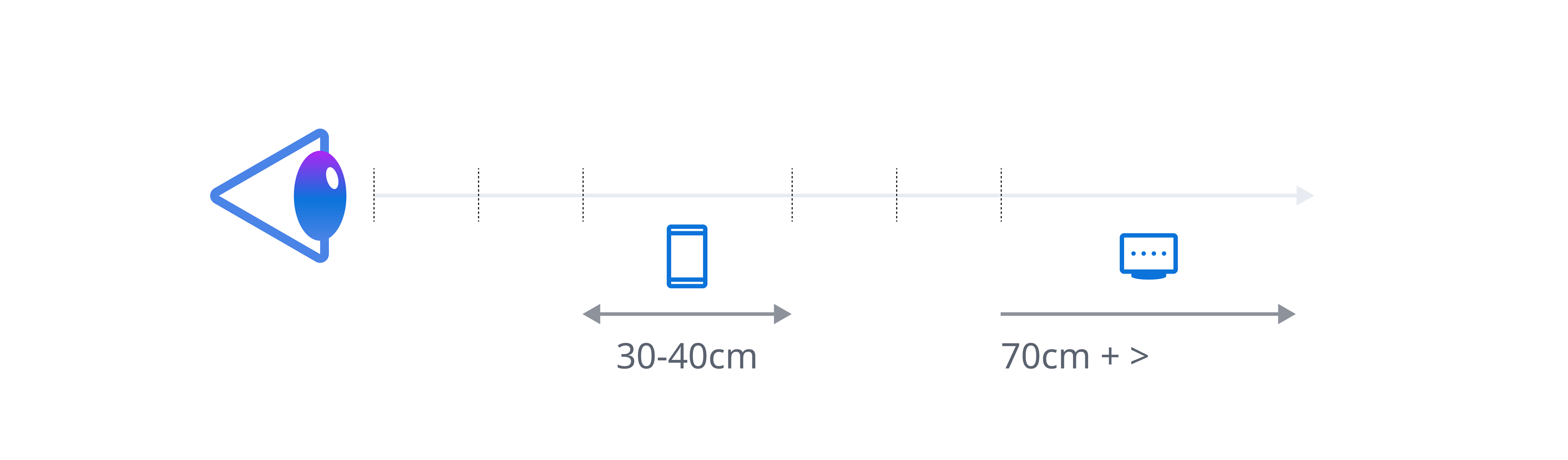
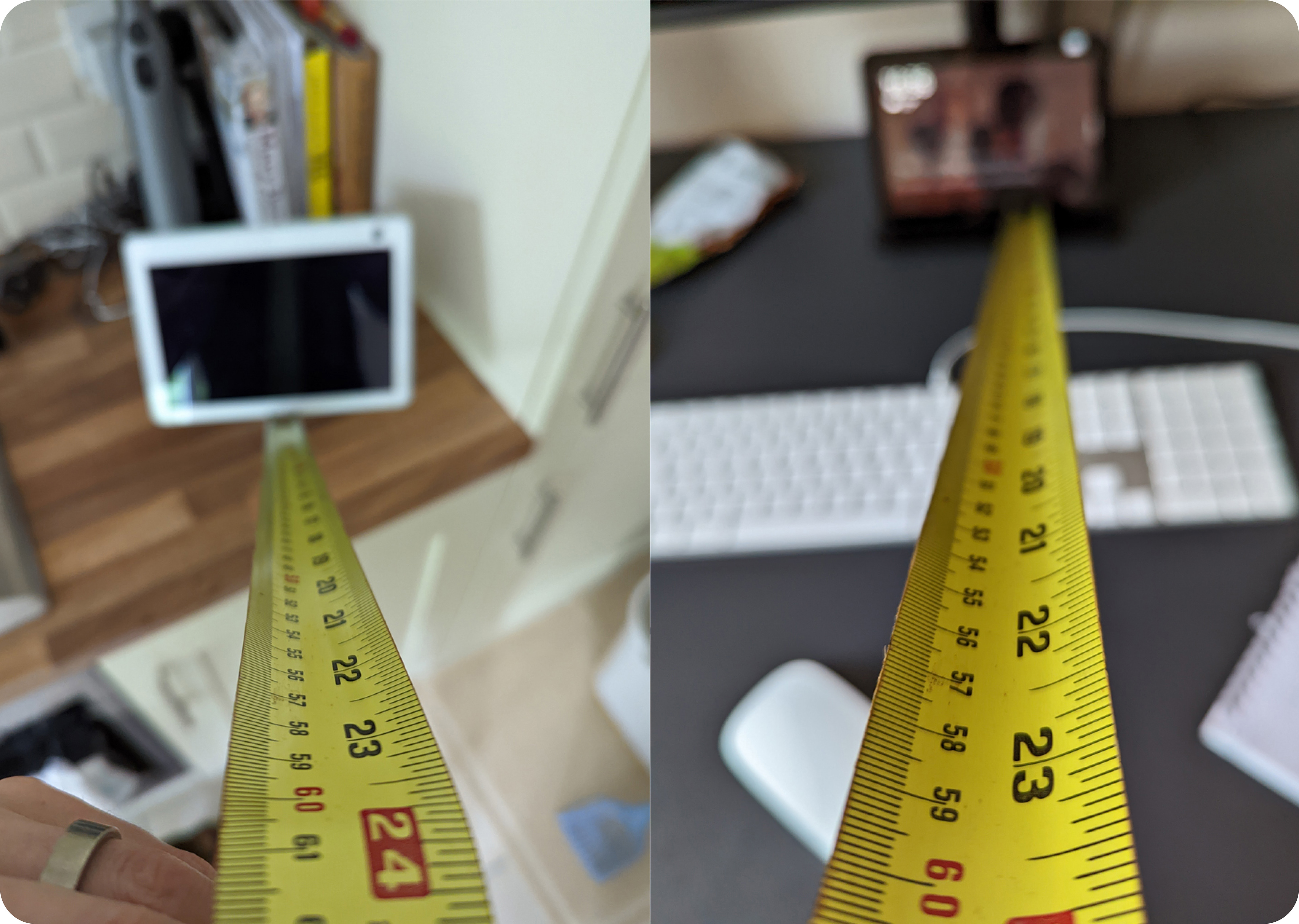
Hub devices are typically used by users who stand and touch the screen at a distance of about 70cm (arms length). This is the optimal position for most users, as it allows them to interact with the device without straining their eyes or arms.
The current shopping Graphical User Interface (GUI) does not support this operating model well.
The current shopping Graphical User Interface (GUI) does not support this operating model well.
Key usability issues
1. The GUI uses small typography. This is hard to read from a distance or angle and sometimes requires users to move closer or lean down to the device in order to read the content.
Arcminutes
The angular size of an object is the angle it subtends at the eye. The angular size of an object depends on its actual size and its distance from the observer. The farther away an object is, the smaller its angular size is.
A type size that is optimal for users on mobile devices, will be perceived as smaller on devices that are operated at a greater distance. In order to achieve the same level of usability the type size needs to be increased to account for the operating distance.
2. The GUI uses touch buttons that are similar in size to mobile devices. These are too small for the device's placement and usage. Hub devices are similar to digital kiosks, such as ATMs and need larger buttons or gestures to make it easier for users to operate.

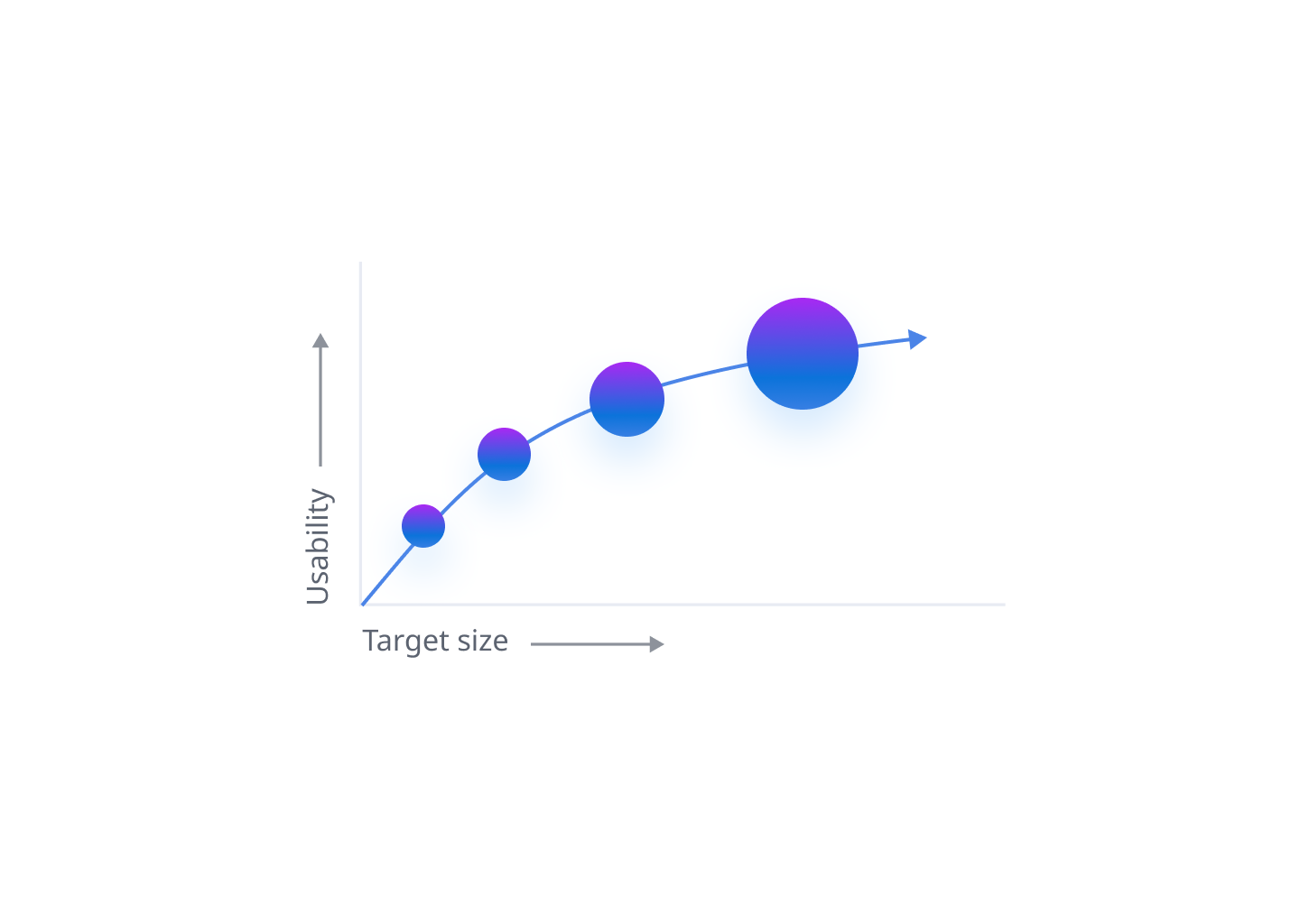
The time to acquire a target is a function of the distance to and size of the target.
3. The UI does not have a clear or consistent navigation pattern, which confuses users.
4. Voice commands are not always reliable or obvious.
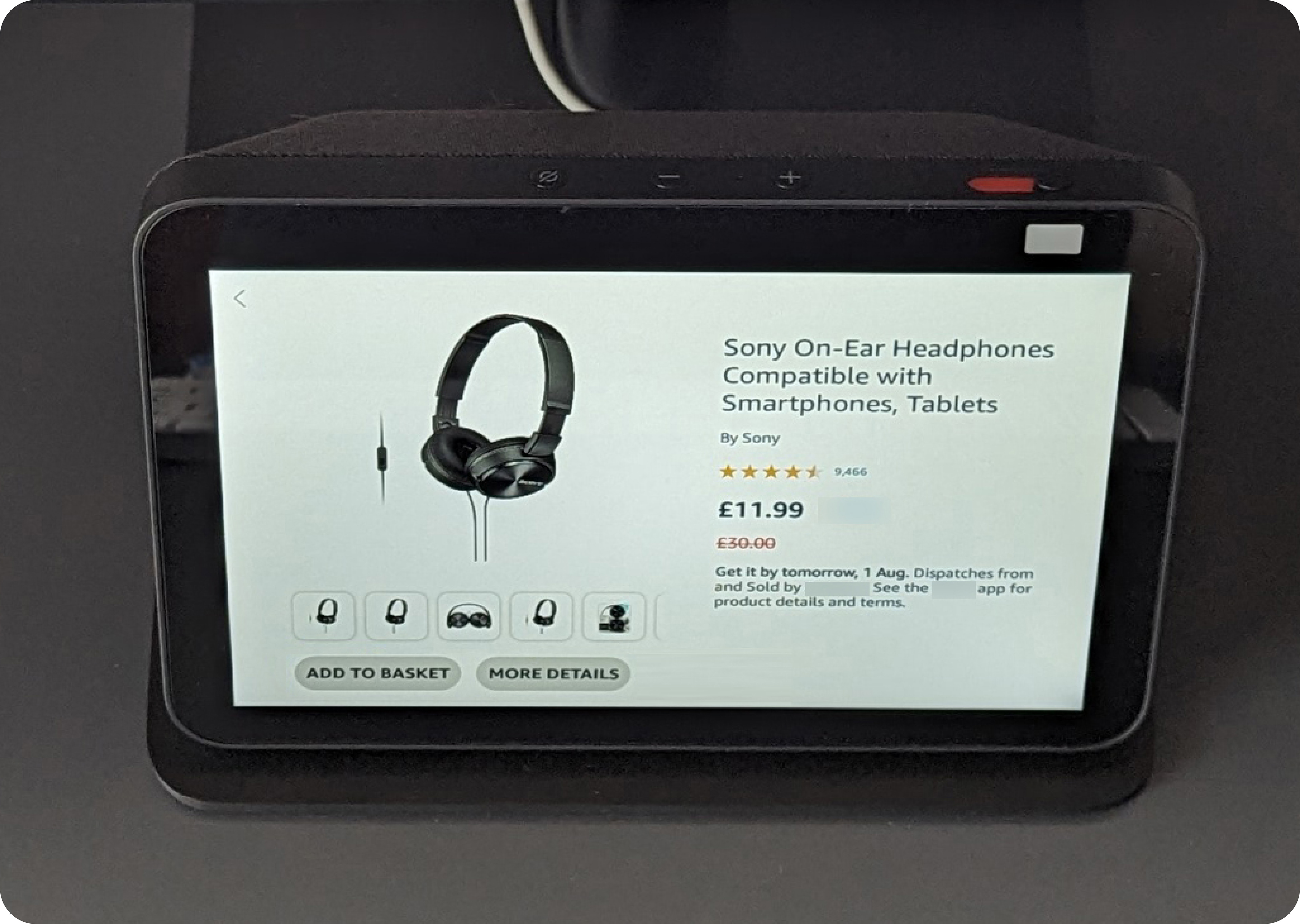
5. The GUI does not provide all the available product information and quite often users are redirected to the mobile app for more details. Without this information users cannot make an informed purchase decision and have to abandon the device.
AI and voice limitations:
1. The current AI/voice assistant can only recognise pre-scripted voice phrases or very similar variations that match the voice engine's criteria. This is because the current AI model has a limited understanding of language and cannot comprehend everything a user says.
2. GUIs are directly linked to a pre-scripted voice actions. This means even if the AI could understand everything a user said, it may not be able to direct them to a suitable information screen.
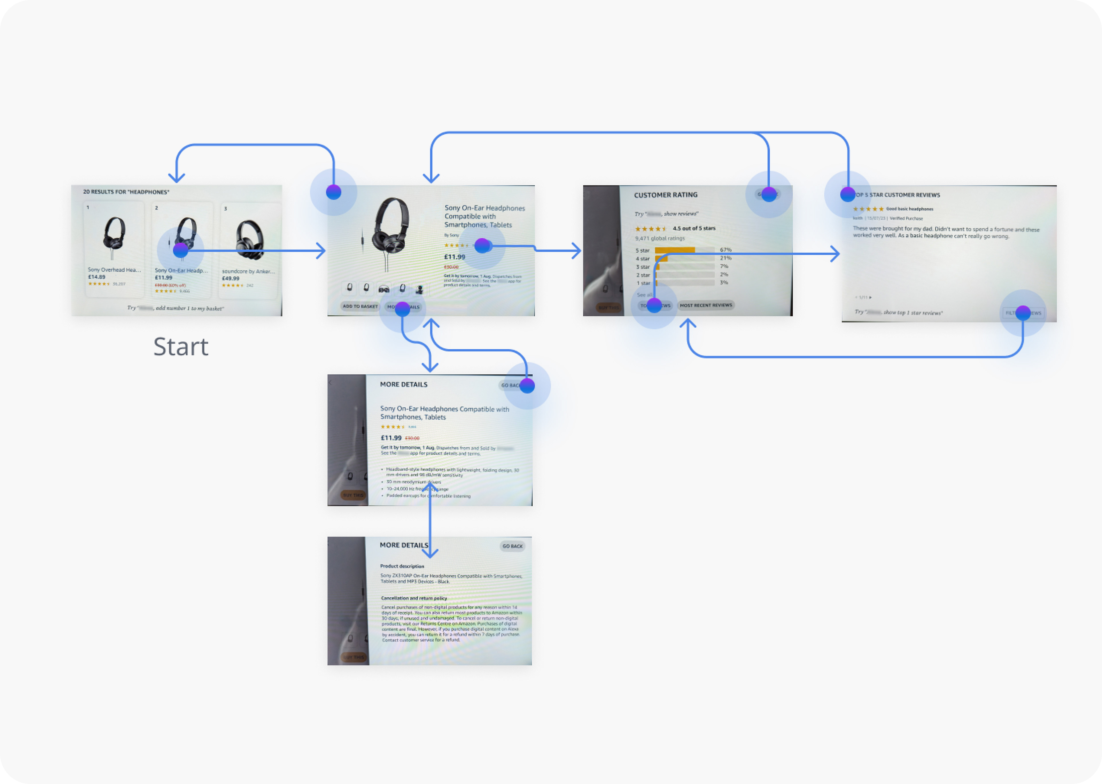
Existing user journey
Main customer pain points:
1. Difficult to navigate by touch and/or voice
2. High cognitive load to complete tasks
3. Doesn't provide content parity with the company's app and website
Design goals:
1. Simplify the navigation
2. Improve the touch usability of the GUI
3. Reduce cognitive load and make content easier to consume
4. Include ways for the customer to access all available data
— Initial concepts —
Prototype 1
Horizontal scroll
User testing
7 out of 10 said the landing screen met or exceeded their expectations regarding information/level of detail
10 out of 10 users said horizontal scroll wasn't instinctive to them and they didn't expect to find more information on the product if they swiped across. When asked what they would expect to find, they all said more images of the product.
When asked how they would find more information about the product, users tried tapping the product title, image or swiping up on the page. Some also attempted to use a voice commands.

“I thought when you scrolled to the side you would see more images, but there’s more options…I didn’t think of that but this is a great idea. It just wasn’t what I was expecting.”
The horizontal interaction was quickly learned, once users where familair with the pattern they instantly swiped across on other prototype concepts.
"Product details are very easy to find once you know where to find them”
60% of users found it easy to find more information on the product
Prototype 2
Vertical scroll
User testing insights:
8 out of 10 said the landing screen met or exceeded their expectations regarding information and level of detail.
10 out of 10 users said they expected to see more details on swipe up.
10 out of 10 users said the pagination dots were a good indicator that there was more information if they swipe the page up. The dot pagination is a pattern they are familiar.
Some users expressed an interest in the dots being tappable, to aid with quick navigation and allow them to jump up and down the page without swiping.
10 out of 10 users instinctively swiped up on the screens to see more details

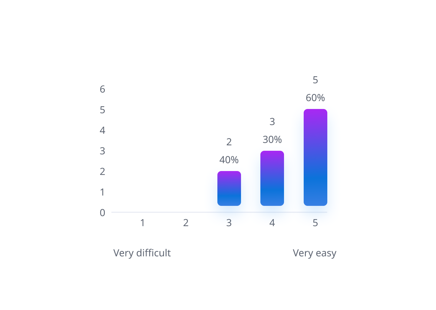
90% of users found it easy to find more information on the product
A/B testing 1
Scrolling behaviour
When asked to select between A (Horizontal scroll) and B (vertical scroll) for navigation and layout of information, 6 out of 10 users selected B for its intuitive and familiar navigation pattern.
"Vertical scroll more familiar"
The majority of users found vertical scroll more intuitive and familiar, as it is consistent with most web design standards and user habits. Horizontal scroll, on the other hand, was perceived as less user-friendly and more confusing by some users.
A
Horizontal scroll
B
Vertical scroll
(User preference)
A/B testing 2
Information density
Between A (Card title only) vs B (Card title plus highlights) all participants preferred B as it provides enough information without forcing them to have to tap into the page.

A
B
(User preference)
High level Findings
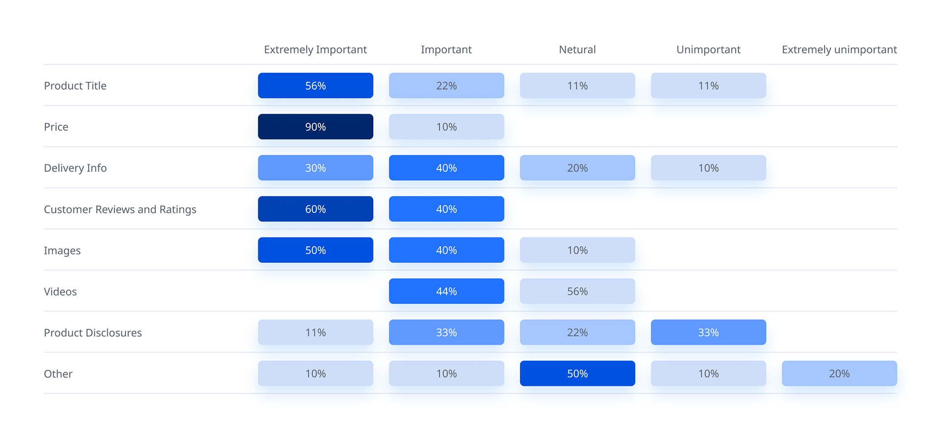
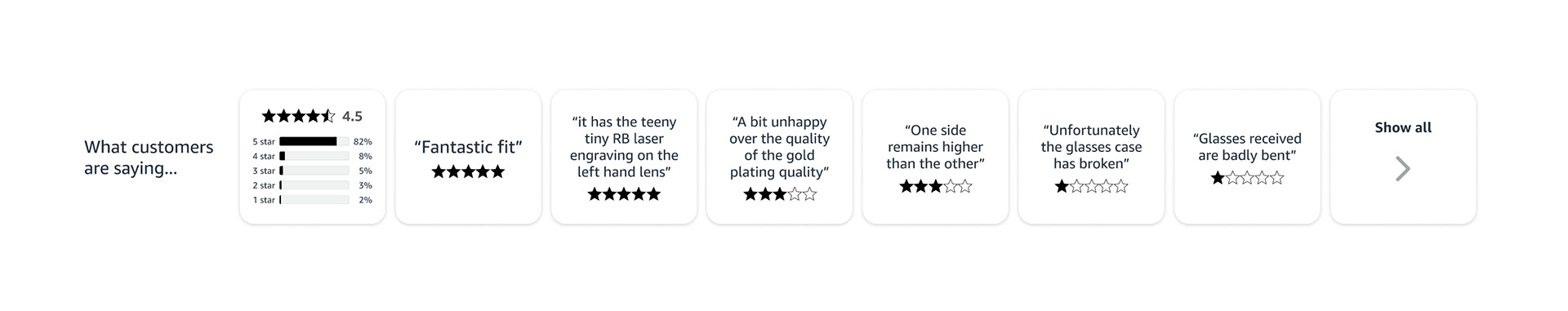
1. At first glance customers generally value price (100%), reviews (100%), product title (78%) and images (90%).
2. Users expect to see more description about products like the content found on the website or app because they are trying to find answers and the current voice assistant cannot answer these directly.
3. 5 out of 10 customers indicated that they didn’t feel the price was that noticeable as their eye wasn’t drawn to it and they found themselves looking around the screen to find it.
4. Users naturally tried to vertically scroll as it is a common interaction pattern on all other digital devices.
Next steps
1. Use vertical scroll as the primary navigation pattern to discover more information
2. Use horizontal scroll as a way to for users to browse related content sections
3. Explore ways to make horizontal scroll more intuitive/instinctive
4. Make the price more prominent on screen
5. Keep summary content on the detail cards
6. Explore product configuration menu
— Design Iteration —
Prototype 3
Horizontal scroll improvements
User testing
When asked to find more information 8 out of 8 users scrolled horizontally without hesitation. When asked why they said it was an educated guess based on the card formatting, as they could see image and text based cards.
Some users mentioned that they were unsure of what content to expect to see next. They assumed it was information directly related to this product.

Prototype 4
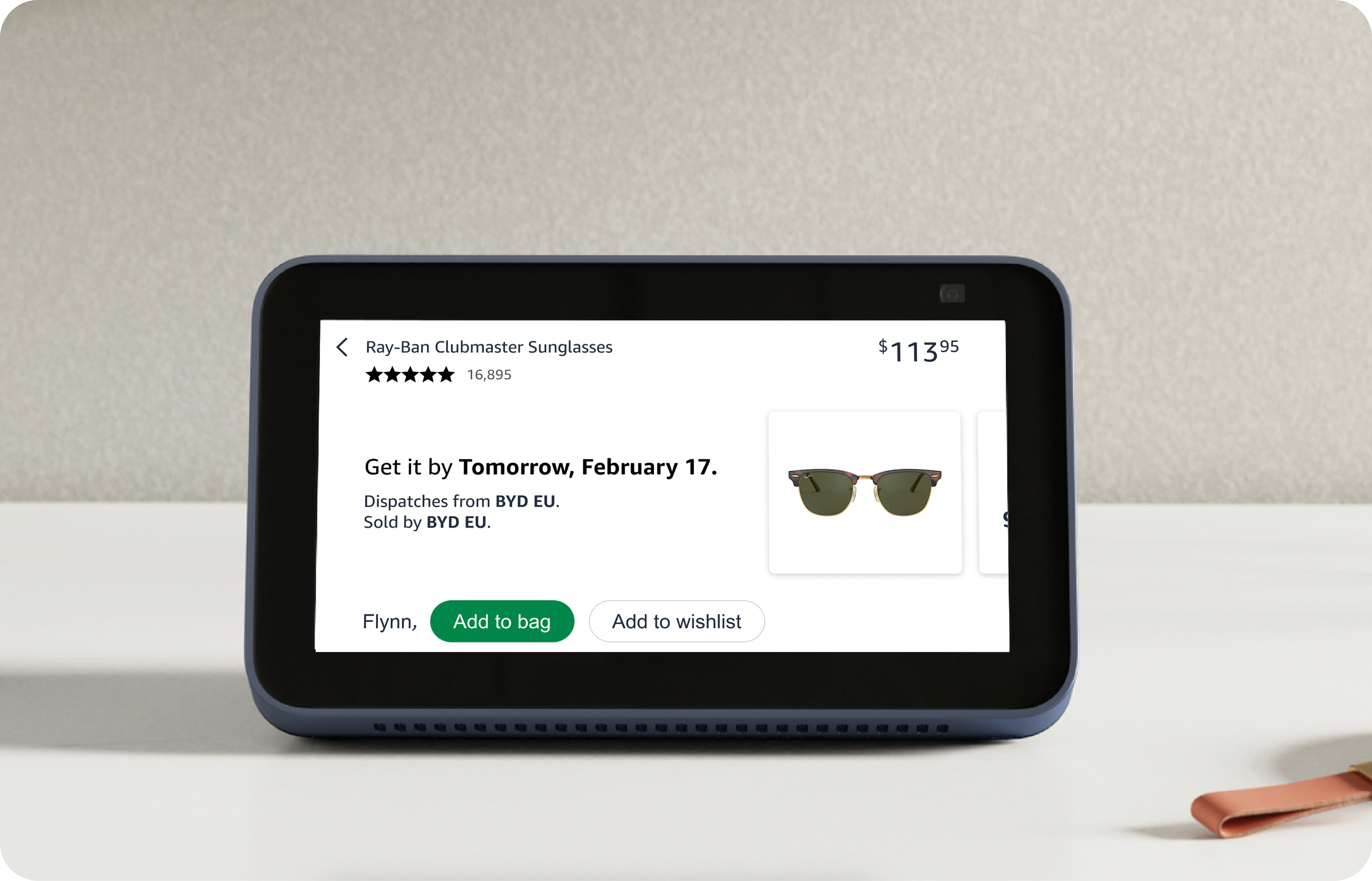
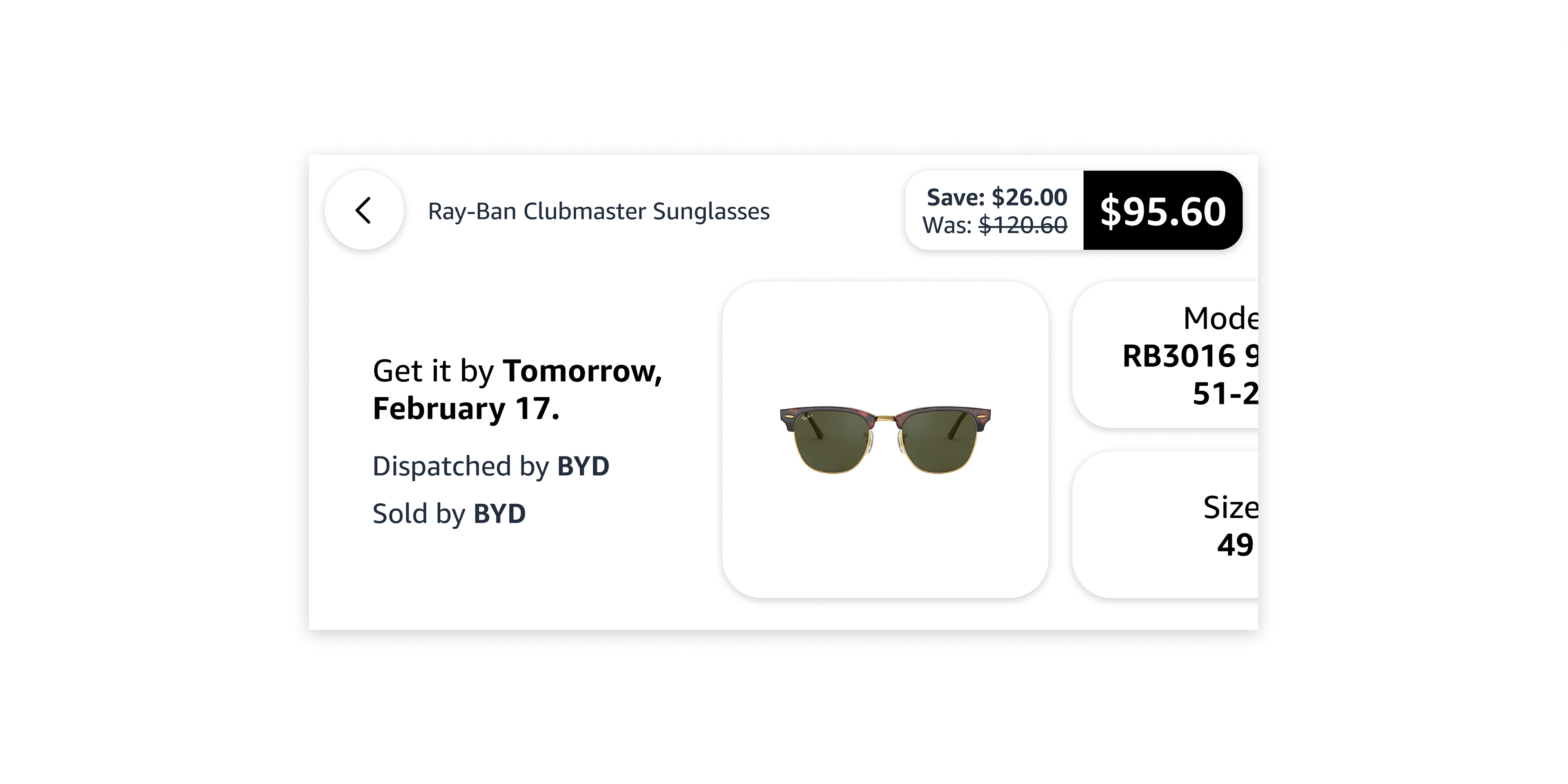
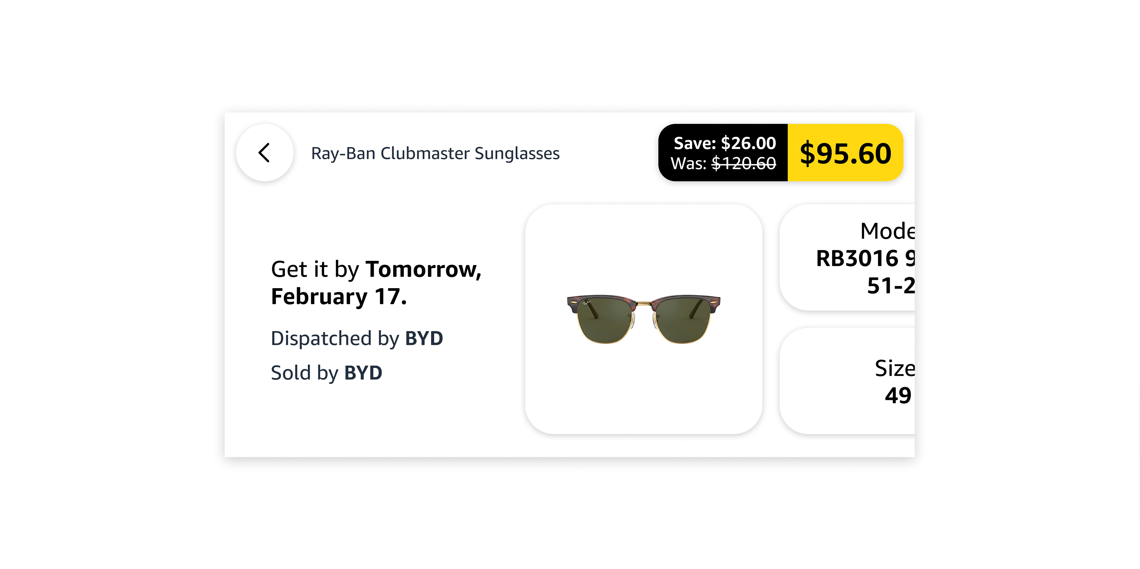
Price and purchase controls
Discount price variations


User Testing
8 out of 8 users could quickly identify the products price and felt it stood out the most on the interface.
8 out of 8 users said the yellow price jumped out at them and alerted them to the discount.
7 out of 8 users, felt they could ask the AI to purchase the product or if they tapped on the price it would take them to a checkout interface. They thought this because the price also looks like a button.
8 out of 8 users felt it was a great experience when they tapped on the price button,

“Oh wow, that’s what that does, very cool”
4 out of 8 users said they felt uncertain about their product selection when they used the new purchase interface. They wondered if the product configuration they had chosen on the detail screen would be preserved when they opened the purchase overlay. Although all customers assumed it would retain the previous configuration they had selected.
Prototype 5
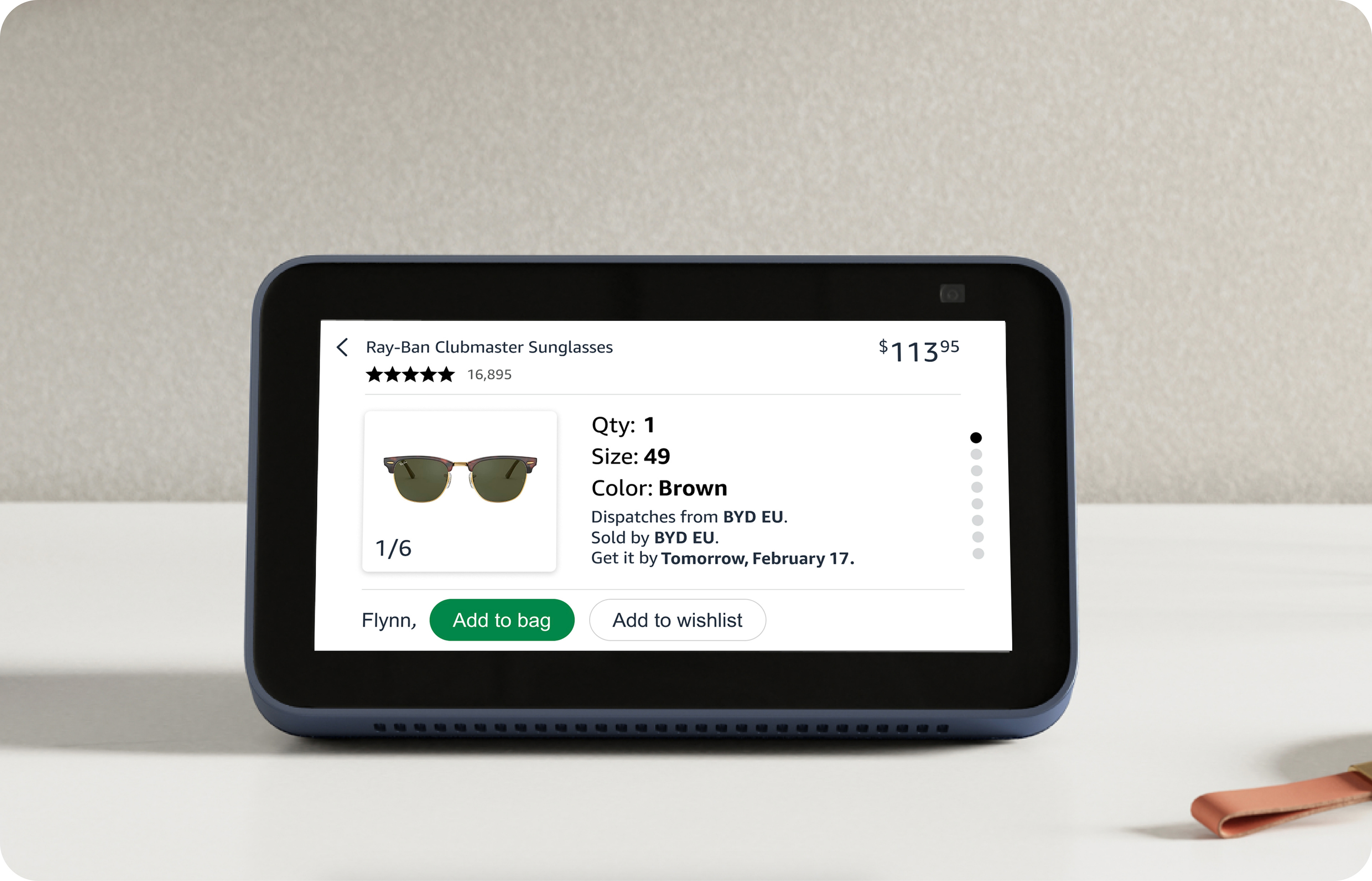
Product configuration
User testing
When asked how would they change the product configuration, 8 out of 8 users said they would tap on the configuration that they want to change. All users assumed this would open an interface with options they could choose from.
4 out of 8 users also said they would ask the AI assistant what options are available. Or if it was something they knew they wanted, like a particular size or colour, they would ask the AI assistant if it was and available.
“If I knew I wanted a particular colour, I’d just ask for it”
8 out of 8 customers felt changing configurations would be faster by touch as they wouldn’t likely know what is available, in order to ask for it.
Recommendations
1. Explore alternative purchase controls that enables customers to see existing product configuration before they take a final purchase action
2. Explore integration of horizontal and vertical scroll into the one UX to enable users to explore more content related to the product
— Final solution —
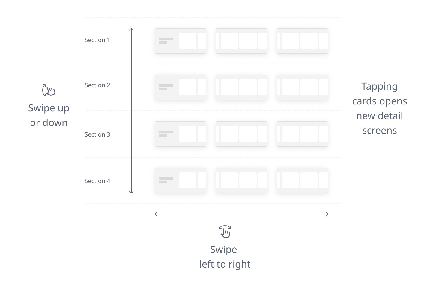
Navigation pattern
Swipe up or down to discover different categories of content. Swiping left and right to explore category content.
Adaptive pattern
Hub devices vary in screen size and in order to keep engineering and design effort to a minimum, the pattern uses parameters to auto adapt to the device and screen size. This means that the same pattern can be applied to different devices without requiring any modifications or adjustments. The parameters are based on the device's dimensions, resolution, orientation, and pixel density. The pattern automatically adjusts the layout, font size, spacing, and alignment of the elements according to these parameters. This ensures that the pattern is consistent, readable, and user-friendly across different devices.

Interaction patterns
Back to landing screen function

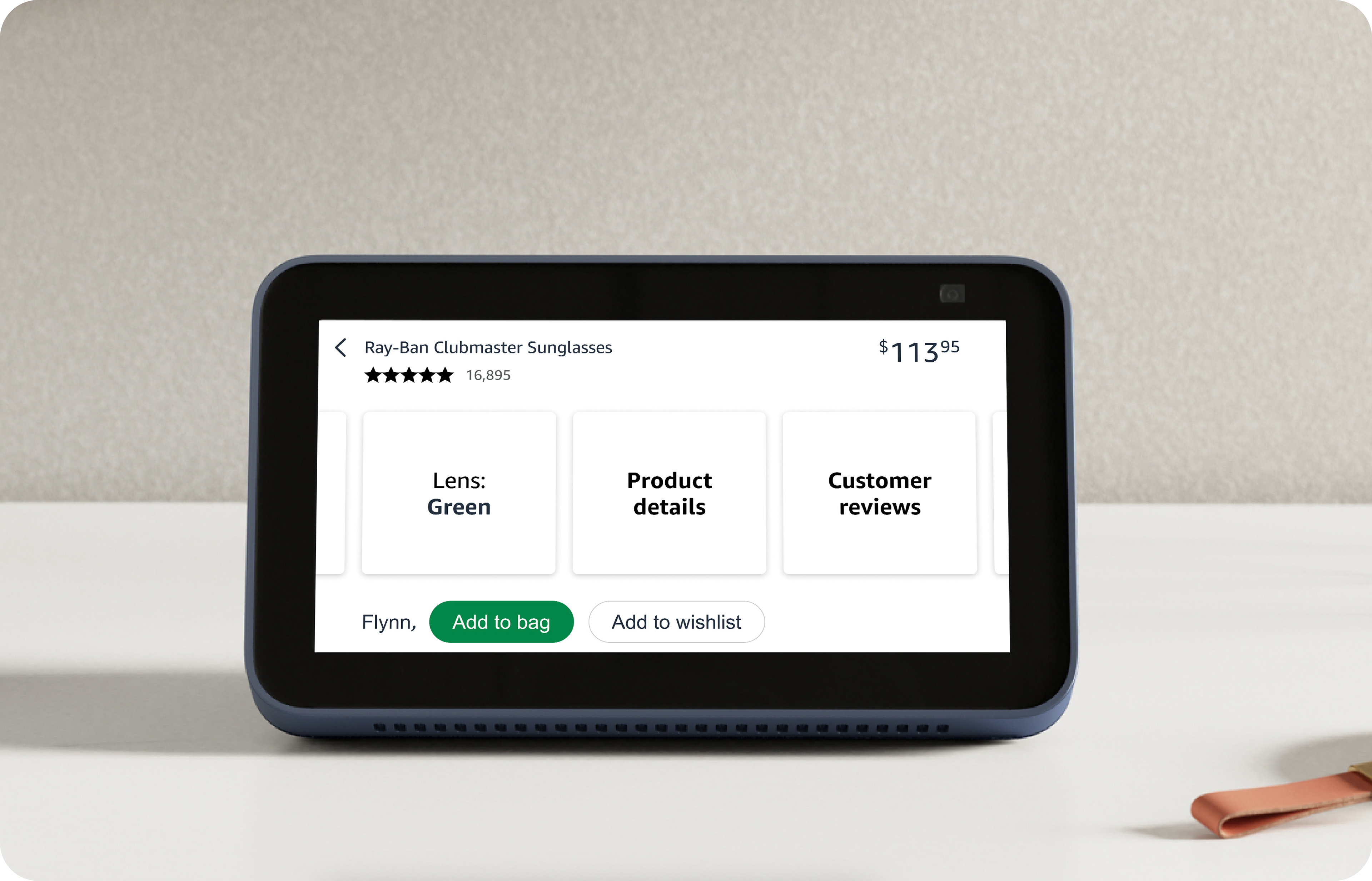
Product configuration

Image/media gallery

Purchase controls
AI generated content
Machine learning will be used to extract relevant highlights from customer reviews of different ratings, based on the user's past search and browsing behaviour. This way, the user can quickly discover the key features or drawbacks of a product, without reading all the reviews. By showing a variety of reviews, we can also increase the user's trust, as they see that the AI is fair and transparent about the product's pros and cons.
Prototype 6
The example below demonstrates how the AI can generate a new panel with relevant content based on the user's question.
Prototype 7
Full experience
User testing
10 out of 10 users naturally scrolled vertically first. They said it was a common interaction pattern for them and that's what they do on their mobile.
8 out of 10 users assumed the horizontal content shown on the first load was related to product specifics.
When asked how they would make a purchase by touch 10 out of 10 users said they would tap on the price “button”.
3 out of 10 customers expressed a desire to have purchase buttons present on first load of the screen so they buy it immediately.

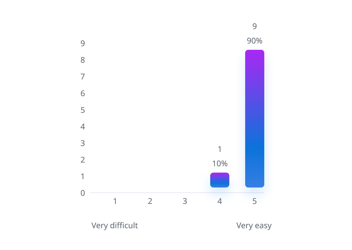
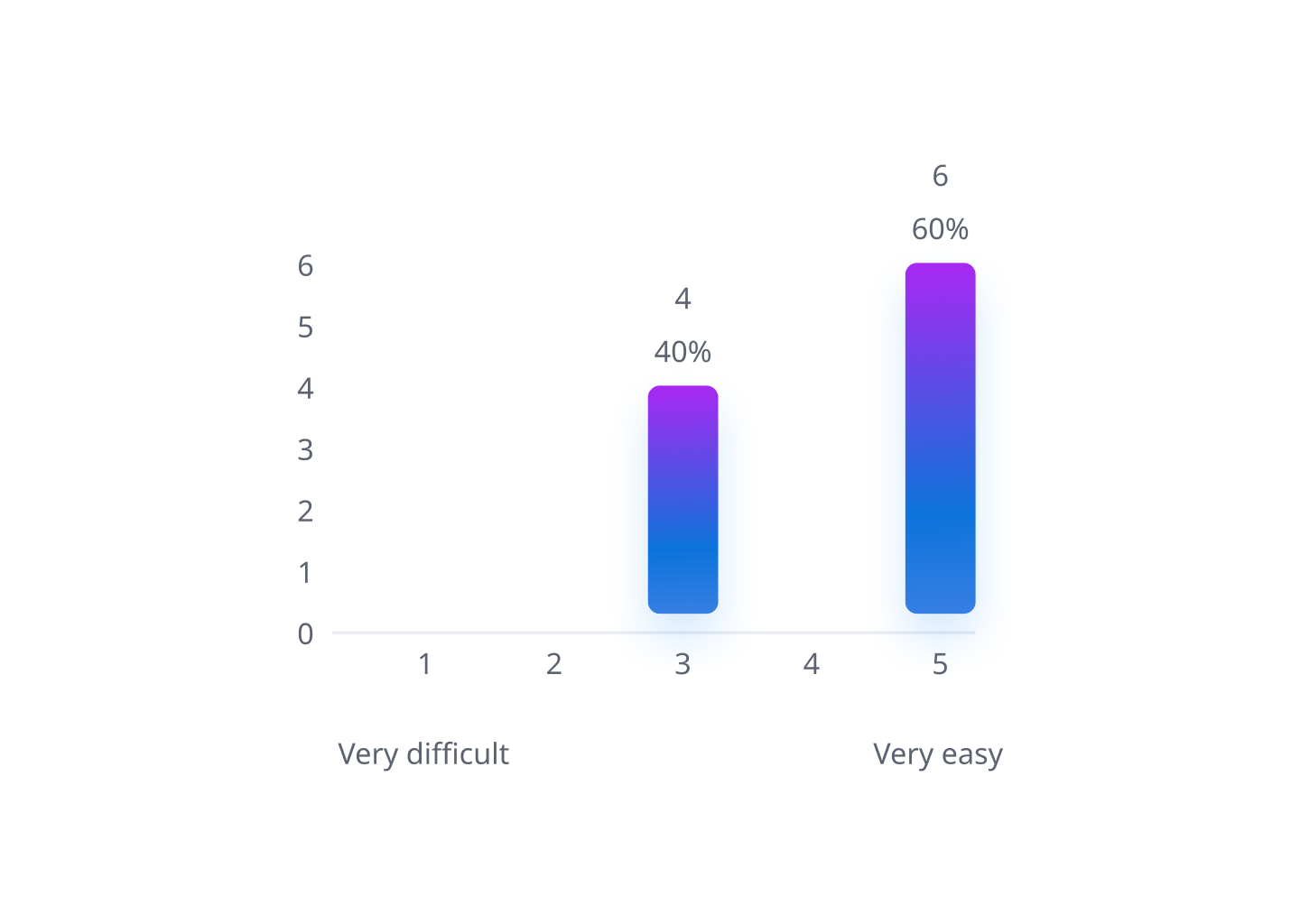
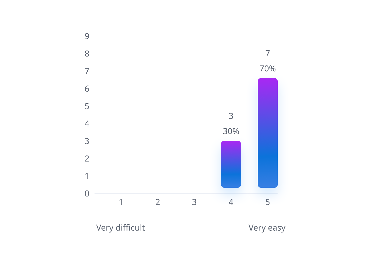
100% of users said tapping on the 'price button' to reveal the purchase controls was an easy to use experience.
5 out of 10 users said they would be happy for an AI assistant to buy the item for them. The other 5 expressed a desire to complete the task by touch as they felt voice interfaces don’t understand them very well and it's just easier to tap a button if it's right there.
100% of users found it easy to find more information on the product and felt they could make a purchase based on the information provided.
Conclusion
The new experience was a hit with 100% of users, who praised its ease of use and the abundance of product information. They said it helped them make better product choices, as they could compare features, prices, and reviews. However, users were not very happy with the voice assistant, which they found slow, inaccurate, and unnatural. The study suggested that the voice assistant needs to be faster, more accurate, and more natural to increase user satisfaction and trust. It highlighted that users preferred to use voice for broad product searches and touch for detailed product exploration, as they often did not know what information they wanted. However I believe LLM technology will address a lot of these issues and change users perception of voice interactions in the near future.
You may also like